International Trade in Apples

Apples are part of the American language: Johnny Appleseed, American as apple pie, apple-pie order, apple of my eye, sure as God made little green apples, the  Big Apple of New York City, and here in Minnesota, the Mini-Apple of Minneapolis. So it\’s a little startling to discover at the website of the Food and Agriculture Organization that the US is actually #2 in the world in apple production, lagging far behind China. In fact, China produced 36 million tons of apples in 2011, while the U.S. produced 4.2 million tons. Other major world apple producers include the far-flung group of Turkey, Italy, India, Poland, France, and Iran.

But even within the production of apples, there is global specialization. The US economy both exports and imports apples, depending on the season, but overall runs a trade surplus in apples. However, the U.S. runs a substantial trade deficit in frozen apple juice concentrate, relying heavily on imports from China. Here are some statistics about U.S. trade in apples from the U.S. Department of Agriculture (which are helpfully archived on-line at Cornell University).

For trade in fresh apples, the website of the US Apple Association reports: \”Approximately one out of every four fresh apples grown in the United States is exported.\” The USDA statistics for 2010 show that the main destinations for exports of fresh apples were Mexico and Canada, as one might expect from proximity, then followed by Taiwan, Indonesia, Hong Kong, and the United Kingdom. One suspects that unless the 7 million people of Hong Kong are completely obsessed with eating apples, a substantial share of those U.S. exports of fresh apples are ending up in China.

In terms of imports, the U.S. Apple Association reports that about 6% of all fresh apples consumed in the United States are imported. Roughly two-thirds of those imported fresh apples come from Chile and another 20% from New Zealand–that is, U.S. imports of fresh apples are mainly from the Southern Hemisphere when apple production is out of season here. The total value of U.S. fresh apple exports was $827 million in 2010, while the value of fresh apple imports was $169 million.

When it comes to apple juice and cider, on the other hand, about 85% of U.S. consumption is imported, and about 80% of those imports come from China, according to the USDA statistics for 2010. Only about 8% of U.S. production of apple juice and cider is exported, most of that to Canada. Total value of U.S. apple juice imports in 2010 was $444 million; total value of U.S. apple juice exports, just $32 million.

I will spare you additional data on dried apples, canned apples, comparisons of apple yield statistics over time, and the like. But the main point is that the world economy is full of patterns that I would not have guessed before looking at the data.  The notion that the U.S. exports fresh apples to China and runs a trade surplus in fresh apples, while importing apple juice from China and running a trade deficit in apple juice, is one of those patterns. But if you think about varieties of apples, some more suited to being eaten as fresh apples and some more suited to being used for juice, along with the differing transportation costs of shipping fresh apples and apple juice, these patterns make some economic sense.

Note: Thanks to faithful reader Chris Laughton, the Director of Knowledge Exchange at Farm Credit East, for calling the basic facts about U.S. international trade in apples to my attention.

Discouraged Workers and Unemployment

As the unemployment rate has drifted down from its peak of 10% in October 2009 to its current level at 7.3%, a number of commenters have noted that the labor force participation rate has also been falling, from about 66% in late 2007 before the start of the recession to a current level of around 63.2%. Thus, is the drop in the unemployment rate nothing more than a drop in the share of adults seeking to participate in the labor market in the first place? More specifically, what do the statistics tell us about whether those who are outside the labor force are seeking to work?

Just to be clear on the basics, the unemployment rate is calculated as part of the Current Population Survey, which defines unemployment in this way: \”Persons are classified as unemployed if they do not have a job, have actively looked for work in the prior 4 weeks, and are currently available for work. Persons who were not working and were waiting to be recalled to a job from which they had been temporarily laid off are also included as unemployed. Receiving benefits from the Unemployment Insurance (UI) program has no bearing on whether a person is classified as unemployed.\”

What about those who would like a job, but are so discouraged that they have given up on looking? The same survey asks people who are not in the labor market various questions, and divides them up into categories. As of August 2013, there were about 90 million adults not in the labor force. However, many of them were out of the labor force by choice: for example, they were retired, or full-time students, or spouses staying home with children. The survey asks those who are out of the labor force if they want a job, and in August 2013, about 6.3 million answered \”yes.\” Here\’s a graph from the Bureau of Labor Statistics website showing the number of those out of the labor force who tell the survey that they want a job. The number has clearly risen substantially, by about 2 million, since the start of the recession in 2007. However, it\’s interesting to note that the total of those out of the labor force who want a job is not that different now than it was back in 1994, in the aftermath of the 1990-91 recession and before the dot-com boom of the mid- and late 1990s had taken hold.

Of those who are out of the labor force but would like a job, a subcategory is the \”Marginally Attached to the Labor Force,\” which refers to \”persons who want a job, have searched for work during the prior 12 months, and were available to take a job during the reference week, but had not looked for work in the past 4 weeks.\” In August 2013 there were about 2.3 million of the \”Marginally attached,\” and here\’s a graph showing how that number has evolved over time.

Of the \”Marginally Attached,\” yet another subcategory is \”Discouraged Workers,\” which refers to \”those who did not actively look for work in the prior 4 weeks for reasons such as thinks no work available, could not find work, lacks schooling or training, employer thinks too young or old, and other types of discrimination.\” There were 866,000 discouraged workers in August 2013, and here\’s how their number has evolved over time.

So what does all this mean about interpreting the fall  in the unemployment rate? Troy Davig and José Mustre-del-Río discuss what they call \”\”The Shadow Labor Supply and Its Implications for the Unemployment Rate\” in the Third Quarter 2013 Economic Review published by the Federal Reserve Bank of Kansas City. They refer to those who are out of the labor force but tell the survey that they would like to work as the \”shadow labor force.\” They write:

\”Nevertheless, despite the swelling size of the shadow labor supply, a return of these individuals to the labor force in numbers that would considerably affect the unemployment rate appears unlikely. Variation in their job search behavior may influence the future path of the unemployment rate modestly, but not greatly. Although individuals in the shadow labor force do flow back into unemployment, the peak in their return to the labor force typically occurs in the first few post-recession years. The recent, post-recession peak of their flow back into unemployment has already occurred, in mid-2010. While another surge back into the labor force by individuals in the shadow labor supply is possible, historical evidence suggests it is unlikely.\”

Although Davig and Mustre-del-Río don\’t put it this way, my own interpretation would be that the decline in the unemployment rate since about 2010 is the sign of an economy that is tottering back to a healthier labor market. The number of those out of the labor force who tell the survey that they would like a job bounces around through the year–it\’s not a seasonally adjusted number–typically peaking in June when people start looking for summer jobs. But it hasn\’t shown any particular trend since 2010. I\’ve posted earlier about the long-term decline in the labor force participation rate, a trend which predates the Great Recession, here and here.

A Fertilizer Oligopoly?

C. Robert Taylor and Diana L. Moss have written \”The Fertilizer Oligopoly: The Case for Antitrust Enforcement,\” as a monograph for the American Antitrust Institute. Those looking for examples of possibly anticompetitive behavior, whether for classroom examples or for other settings, will find the argument intriguing. Taylor (no relation!) and Moss set the stage this way:

\”Fertilizers are a critical input in the agricultural sector. Industrial farming in much of the world is heavily dependent on external inputs of nitrogen, phosphorus, and potassium or potash. Following an industry shakeout from 1998 to 2004, fertilizer prices increased dramatically in 2008.High prices persisted for several quarters, dipped in 2009, and have since returned to supracompetitive 2008 levels. The fertilizer industry has, and continues to be, marked by considerable excess capacity. At the same time, large buyers of fertilizer such as China and India are becoming increasingly powerful, putting downward pressure on high prices. Earlier in 2013, the decision of key eastern European potash producers to refuse to deal with such buyers or cut their prices has caused significant disturbance among global producers, with falling profits industry-wide. The foregoing pattern raises a number of questions about the dynamics of supracompetitive fertilizer price increases and profits. Price setting appears to have been the dominant strategy in 2008, shifting to supply cutbacks in 2011 in order to strengthen and maintain prices, particularly with major customers. This was followed by apparent defections from tacit or explicit agreements among global potash producers in mid-2013. Such defections and the subsequent breakdown in any tacit or explicit agreement among producers should be a strong signal that anticompetitive coordination has been at play.\”

They also point out that the fertilizer industry has a history of cartels going back more than a century. One writer identified 83 fertilizer cartel episodes from 1902 to 2010. The fertilizer industry includes a number of separate firms, but in the U.S. and Canada, they are organized into government-approved export cartels. In the United States, the Webb-Pomerene law passed back around World War I allowed small and medium-sized companies to form export cartels to counterbalance the power of foreign governments, as long as such cartels did not affect domestic prices. The fertilizer export cartel has been up and running since. Nowadays, the global industry structure looks like this:

\”The structure of the world’s phosphorus and potash markets, while complex, may best be viewed as duopolies with small, high cost fringe firms. The phosphorus duopoly is comprised of
the U.S. export cartel, PhosChem, operating with limited antitrust immunity under Webb-Pomerene, and the Moroccan monopoly OCP. There are presently only two members of PhosChem – PotashCorp and Mosaic. PhosChem members account for 52 percent of world phosphorus trade. … The potash duopoly is comprised of the Canadian sanctioned export cartel, Canpotex, that markets potash from Saskatchewan, and a Russian cabal.28 The three owner-members of Canpotex are PotashCorp, Mosaic, and Agrium, each with a fixed market share of 54 percent, 37 percent and 9 percent of export sales, respectively. Canpotex accounts for 61 percent of world potash trade, including trade by other potash companies in which PotashCorp has significant ownership. The Russian cabal accounts for 32 percent of trade, with a high-cost, non-integrated fringe accounting for the remaining seven percent.  … Many of the major phosphorus producers also manufacture nitrogen fertilizer, partly because a source of nitrogen is required to stabilize phosphorus, and partly because many fertilizer manufacturers sell blended nitrogen-phosphorus-potash fertilizer at wholesale and retail. … While global nitrogen fertilizer producers are not as closely intertwined as are phosphorus and potash producers, duopolies in phosphorus and potash potentially invite antitrust mischief. They achieve this, at a minimum, through the sharing of information and executive decision-making between PhosChem and Canpotex, and the division of markets inside and outside North America. \” 

Here\’s the pattern of fertilizer prices in recent years. In the nature of things, it is difficult to prove that price increases are a result of oligopolistic behavior as opposed to market prices, although Taylor and Moss provide a number of statistical and anecdotal arguments to make the case.

Their narrative is that the fertilizer oligopoly may have been derailed in 2013 by China and India. \”Major fertilizer customers such as India and China have developed into powerful buyers, a shift that could have potentially important implications for the pricing and output strategies of large sellers. …Reports indicate that fertilizer contracts for India and China are now negotiated by a single entity, or only a few entities for each country. … The exercise of countervailing power by China and India may be responsible in part for the significant market disruption in mid-2013.\”

The Federal Trade Commission has not pushed back against the fertilizer oligopoly, instead arguing that the price spike in 2008 was related to various demand and supply factors. However, in June 2012 the U.S. Court of Appeals for the 7th Circuit refused to dismiss a private antitrust suit concerning the potash market, and wrote in a unanimous opinion, “the inferences from these allegations is not just plausible but compelling that the cartel meant to, and did in fact, keep prices artificially high in the United States.” Soon after, the case was settled for more than $100 million.

Taylor and Moss write: \”Damages from supra-competitive pricing of fertilizer likely amount to tens of billions of dollars annually, the direct effects of which are felt by farmers and ranchers. But consumers all over the world suffer indirectly from cartelization of the fertilizer industry through higher food prices, particularly low income and subsistence demographics. … [I]t is clear that corporate and political control of essential plant nutrients may be one of the most severe competition issues facing national economies today.\” Without prejudging the verdict, the fertilizer market seems like a situation where the Federal Trade Commission, the U.S. Department of Justice, and antitrust agencies around the world should be taking another look.

Slow Takeoff for Young Workers

My office is on a college campus, so it\’s especially hard to avoid noticing that the class of \’13 is going to graduate into a difficult job market, as did their predecessors in the classes of \’12, \’11, \’10, \’09, and \’08. Indeed, colleges and universities are now experiencing a situation in which freshmen arrived in a lousy job market, heard all about the lousy job market for four years of college, and then graduated into a lousy job market. When one hears complaints either about the excessively high cost of college education or about the overly careerist instincts of recent college cohorts, it\’s worth remembering that many of them have experienced subpar labor market rewards from their college degree in recent years. Anthony P. Carnevale,
Andrew R. Hanson, and Artem Gulish explore these issues in their report  Failure to Launch: Structural Shift and the New Lost Generation, a September 2013 report from the Georgetown Public Policy Institute. Here are a few of the figures that jumped out at me.

The proportion of young people in the labor market is dropping, while the share of older people int he labor market is rising. This figure shows that back in 1980, about 50% of all 18 year-olds were in the labor market; by 2012, it was about 30%. However, those in their 50s, 60s, and older are more likely to be in the labor market than they were in 1980.

In fact, the share of young people in the labor market has fallen to a 40-year low. While the decline has been especially pronounced in recent years, it clearly dates back several decades. The usual explanation is a combination of a positive and a negative factor. The positive factor is that more young people are attending colleges and universities, and so are not in the labor force in their early 20s. The negative factor is that the kinds of jobs that were were available to those without a college degree back in the 1960s and 1970s–blue-collar jobs with significant skills that offered the prospect of lifelong economic advancement–have become increasingly scarce.

Today\’s young adults are getting a slower start on adult life. I As a result, it is taking young people longer to start climbing the career ladder. This graph shows the earnings of someone at each age level compared to median earnings, for 1980 and for 2012. In 1980, for example the typical 18 year-old had earnings that were about one-quarter of the median income, but the typical 26 year-old had earnings that were equal to the median income. However, in 1980 earnings dropped off quite sharply when people reached their early 60s. In 2012, the typical workers reach the median level of earnings until age 30–four years later than their counterparts in 1980.And in 2012, while wages still drop off when people reach their early 60s, the decline is not as rapid or as far.

And of course, a later start on careers is also one of the reasons why people are getting married later and starting families later. Carnevale, Hanson, and  Gulish write: \” Evolving social norms entangled with economic hardships have led young people to delay household and family formation. Two-thirds of young adults in their 20s cohabitate; the average age of  marriage increased from 21 to 26 for women and 23 to 28 for men between 1970 and 2006. Over  the same period, the average age of a mother at the birth of her first child increased from 21 to 25. In 1960, three out of four women and two out of three men completed school, left home, achieved financial independence, were married and had children by age 30. In 2000, less than half of women and only one-third of men reached the same milestones by age 30.\”

There is a lot to be said for marrying and having children a little later in life. I married at age 30 and had my first child at age 37. But when I visit with friends my age whose children have already graduate from college, or when I coach youth soccer games on creaky knees, I recognize that a slower takeoff to adulthood has its tradeoffs, too.

Wealth Patterns and Retirement Readiness

Throughout the grim economic statistics of the last five years, I\’ve felt especially badly for three groups: those who have been unemployed at a time when finding a job has been so tough; young people trying to get a foothold in the stagnant labor market; and those who were near or into retirement. This last group is old enough that spending many more years in the labor market wasn\’t a realistic option, even if jobs had been available. Meanwhile, they saw the value of their retirement nest eggs slashed by falling house and stock prices, and have watched while their savings and money market accounts brought them only ultra-low interest rates. LaVaughn Henry offers some evidence on these points in \”Are Households Saving Enough for a Secure Retirement?\” an \”Economic Commentary\” written for the Federal Reserve Bank of Cleveland.

One rough-and-ready measure of how older generations are doing is to look at the accumulation of national wealth. Here\’s actual household wealth, with the brown line showing the actual pattern and the green line showing a steady-growth trend over time. Notice that wealth went above trend in the dot-com boom of the late 1990s, but at the end of that period wealth returned to more-or-less the long-term trend. However, in the housing bubble of the mid-2000s, household wealth not only went further above trend, but then fell to well below trend and has been slower to rebound.

How do wealth patterns look for near-retirement Americans in particular? This graph shows the ratio of wealth-to-income for four different age groups at three different years. Clearly, those in the 55-64 age bracket were feeling a lot better about their retirement prospects in 2007 than they were in 2010.

Although a quick glance at this figure might suggest that older Americans as a group are just as well-prepared for retirement as they were back in 1983, this conclusion would be too quick. As Henry points out, wealth-to-income ratios for the elderly should probably be higher now than in the early 1980s for three reasons. First, people are living longer, so they need more wealth when they retire. Second, back in the early 1980s, a larger share of the US workforce had \”defined benefit\” pension plans, in which an employer promised to pay them a certain amount that was not counted as part of their own household wealth.  Now more people have \”defined contribution\” plans, where your retirement funds are stored up in your own 401k or IRS account, which does count as part of your household wealth. Thus, retirees are more dependent on their own household wealth than they were three decades ago. Third, interest rates right now are historically very low, so retirees need more wealth to generate the income that they would have expected if interest rates were higher.

Finally, what share of retirees have saved enough to sustain their consumption patterns in retirement. Here, Henry turns to calculations from Alicia H. Munnell, Anthony Webb, and Francesca Golub-Sass at the Center for Retirement Research at Boston College called that they call the National Retirement Risk Index (for example, see here). They seek first to calculate how much income people will need in retirement, and then whether people have enough in savings to meet that goal. As they explain: \”A commonly used
benchmark is the replacement rate needed to allow households to maintain their pre-retirement standard
of living in retirement. People clearly need less than their full pre-retirement income to maintain this
standard once they stop working since they pay less in taxes, no longer need to save for retirement, and often have paid off their mortgage. Thus, a greater share of their income is available for spending.\” Using this measure, Henry presents a figure showing the share of households at age 65 that are at least 10% short of meeting this target. This particular rule is of course somewhat arbitrary, but the results are likely to look much the same for any given rule: that is, those in the 1980s were more likely to be ready for retirement than those in the 1990s; those in the 1990s were more likely to be ready for retirement than those in the 2000s; and those in 2010 were least likely of all to be ready for retirement.

There\’s an argument for another day about how to encourage people to save more for retirement during their working lives, but that argument isn\’t especially relevant to those who are already at the edge of retirement or already retired. Planning for retirement is an especially difficult economic decision because we get just one chance to do it; no one gets to live their life multiple times, trying out different patterns of saving and investment each time. And if you happen to be retiring just when the economy enters an epic slump, it\’s bad luck.

Fiscal Policy: How Has Conventional Wisdom Changed?

The last five years have brought economic policies that I would not have thought were even remotely possible if you had asked me in, say, mid-2007. The Federal Reserve and other central banks of high-income countries would push their policy-target interest rates to near-zero, and hold the rates there for years on end, while printing money to buy government debt? I wouldn\’t have believed it. The U.S. government would run budget deficits of 10.1% of GDP, 9.0% of GDP, 8.7% of GDP, and 7.0% of GDP in consecutive years, raising the debt/GDP ratio over that time from 40.5% in 2008 to 72.6% in 2012? I wouldn\’t have believed it. An IMF staff team led by Bernardin Akitoby offers some thoughts on how conventional wisdom about fiscal policy has change in the last five years in a September 2013 Policy Paper, \”Reassessing the Role and Modalities of Fiscal Policy in Advanced Economies.\”

What was the consensus view on fiscal policy back in the Stone Ages of 2007? The IMF report reminds us (as usual, footnotes and citations omitted): \”The prevailing consensus before the crisis was that discretionary fiscal policy had a  limited role to play in fighting recessions. The focus of fiscal policy in advanced economies was often on the achievement of medium- to long-run goals such as raising national saving, external rebalancing, and maintaining long-run fiscal and debt sustainability given looming demographic spending pressures. For the management of business cycle fluctuations, monetary policy was seen as the central macroeconomic policy tool. Fiscal contraction was sometimes recommended during periods of economic overheating as a means of supporting monetary policy, for example to take pressure off the exchange rate in the face of persistent capital inflows. However, during downturns, it was deemed that there was little reason to use another instrument beyond monetary policy.\”

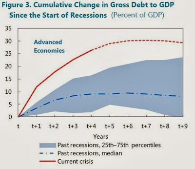
But when the Great Recession hit, this consensus wisdom went out the window in a hurry, not just in the U.S. economy but across the high-income countries of the world. Here\’s a figure comparing the usual rise in the debt/GDP ratio after a recession (the blue dashed line) with what has actually happened in advanced economies since the recession (the red line). The U.S. economy, with a rise in the debt/GDP ratio of just over 30 percentage points, is just about on the average of how high-income countries have expanded their government debt since the Great Recession.

What lessons have we learned about fiscal policy during this period? Here are a few suggested by the IMF:

1) Of course, one main reason that so many governments raised their debt/GDP ratios so much was that the Great Recession was so ferocious. Advanced economies are apparently more vulnerable to severe downturns than most would have believed five years ago. In particular, financial imbalances, asset bubbles, housing and credit booms, and other risks were more severe that expected. . They write: \”The fiscal risks created by large  (relative to GDP), growing, and interconnected financial sectors were also underappreciated, partly  because of confidence in financial markets’ capacity to self-regulate and the
opacity of cross-border exposures.\”

2) \”[T]here is a need for a more holistic approach to measuring public debt and determining “safe’’ levels of debt.\” During the financial crisis, it became apparent that many governments were offering various guarantees and support to their financial sector that would not have been counted as \”government debt\” back in 2007, but turned into government debt very quickly when the crisis hit. \”For example, in the United
States, potential contingent liabilities stemming from the debt of government-related enterprises is
estimated to exceed 50 percent of GDP …\” Official measurements of debt also don\’t take into account future promises for funding government programs, like providing support to the elderly.

3) In some \”safe havens (Japan and the United States, for example), markets can tolerate much higher debt ratios than previously thought, at least for a time.\”

4) In other advanced economies, high government debt can lead to a  harmful \”soverign debt feedback loop.\” Within a given country, banks typically hold a lot of debt from the government of that same country. If the government piles up so much debt that it begins to look risky, then the banks of that country have a lot of assets that look risky. But if the government is to step in and rescue the banks, it will pile up more debt, which will make the banks look even riskier. See the recent history of Greece for how this story unfolds.

5) \”While debate continues, the evidence seems stronger than before the crisis that fiscal policy can, under today’s special circumstances, have powerful effects on the economy in the short run. In particular, there is even stronger evidence than before that fiscal multipliers are larger when monetary policy is constrained by the zero lower bound (ZLB) on nominal interest rates, the financial sector is weak, or the economy is in a slump ..Earlier research often assumed that the impact of fiscal policy was similar across different states of the economy, but a number of recent empirical studies suggest that fiscal multipliers may be larger during periods of slack. …The crisis has not offered conclusive lessons regarding the relative size of revenue and
government spending multipliers. Some recent studies suggest that spending multipliers are larger than revenue multipliers, while others reach the opposite conclusion … \”

6) Fiscal policy operates through automatic stabilizers and through discretionary policy. The automatic stabiliizers come into being because when an economy contracts, the reduction in  economic activity automatically leads to lower tax revenues and to more people eligible for government spending support–without any new legislation. (For more detail on automatic stabilizers, see here.) Discretionary fiscal policy consists of the additional tax cuts or spending increases that required new legislation. Here\’s the division of automatic and discretionary policy across some high-income countries. In the US, for example, automatic stabilizers were about 2/3 of the deficits in 2009-2010, and discretionary policy was the other third.

7) \”The fundamental challenge facing policymakers today is to reduce deficits and debt levels in a way that ensures stability but is sufficiently supportive of short-term economic growth, employment, and equity. …As mere promises to undertake fiscal adjustment later may not be persuasive, gradual consolidation needs to be anchored in a credible medium-term plan.