Telephone Switchboard Operators: Rise and Fall

In  1950, there were 342,000 telephone switchboard operators working for the Bell Telephone System and some independent operators, as well as another 1 million or so telephone switchboard operators who worked at private locations like office buildings, factories, hotels, and apartment buildings. Almost all of these switchboard operators were female. To put it another way, about one out of every 13 working women in 1950 were telephone operators.  But by 1984, national employment as an operator in the telecommunications industry was down to 40,000, and now it\’s less than 2,000 (according to the Bureau of Labor Statistics). 
 David A. Price sketches the  history of this rise and fall in \”Goodbye, Operator,\” appearing in Econ Focus (Federal Reserve Bank of Richmond, Fourth Quarter 2019, pp. 18-20). The story provokes some thoughts about the interaction of workers with new and evolving technologies. 
For more than a half-century from the late 19th century up to 1950, technology was creating jobs as telephone operators. From the phone company point of view, customers needed personal assistance and support if they were to incorporate this new technology into their lives. The workers with what we would now call the \”soft skills\” to provide this interface between technology and customers were reasonably well-rewarded. Price writes:

In the early decades of the industry, telephone companies regarded their business less as a utility and more as a personal service. The telephone operator was central to this idea, acting as an early version of an intelligent assistant with voice recognition capabilities. She got to know her 50 to 100 assigned customers by name and knew their needs. If a party didn\’t answer, she would try to find him or her around town. If that didn\’t succeed, she took a message and called the party again later to pass the message along. She made wake-up calls and gave the time, weather, and sports scores. During crimes in progress or medical emergencies, a subscriber needed only to pick up the handset and the operator would summon the police or doctors. …

While operators were not highly paid, the need to attract and retain capable women from the middle classes led telephone companies to be benevolent employers by the standards of the day — and in some respects, of any day. Around the turn of the century, the companies catered to their operators with libraries, athletic clubs, free lunches, and disability plans. Operators took their breaks in tastefully appointed, parlor-like break rooms, some with armchairs, couches, magazines, and newspapers. At some exchanges, the companies provided the operators with a community garden in which they could grow flowers or vegetables. In large cities, company-owned dormitories were offered to night-shift operators.

But even as the number of telephone operator jobs was growing rapidly, the job of being a telephone operator evolved dramatically. By 1950, the hyper-personal touch seems to have greatly diminished, and the telephone operator skills involved being able to handle \”the board,\” which involved plugging and unplugging several hundred connections per hour.

Looking back, the slow diffusion of automatic telephone switching technology seems a little puzzling. One reason is that digital technology differs in some fundamental ways from the earlier methods of automation. It\’s a standard story that the switchboard operators were replaced by automation. But why weren\’t they replaced by automation much earlier? Part of the answer seems to be that the automated telephone-switching systems in the first half of the 20th century did not actually display economies of scale. Price writes: 

With the electromechanical systems of the day, each additional customer was more, not less, expensive. Economies of scale weren\’t in the picture. To oversimplify somewhat, a network with eight customers needed eight times eight, or 64, interconnections; a network with nine needed 81. \”You were actually getting increasing unit costs as the scope of the network increased,\” says Mueller. \”You didn\’t get entirely out of the telephone scaling problem until digital switching in the 1960s.\”

This pattern of technology led to a situation where small-scale independent phone companies were more likely to use automated switching in the early part of the 20th century, while the giant Bell company continued to rely heavily on combinations of automatic switching with oversight from human switchboard operators–especially for long-distance calls.

More broadly, diffusion of technology is important in many contexts. Some well-known historical examples of important technologies that diffused slowly, over decades, include tractors and electricity. In the modern economy, a prominent pattern across many industries is that a few leading \”superstar\” firms are jumping farther ahead in terms of productivity, and their example of how to achieve such productivity gains is apparently not diffusing as quickly to other firms. There\’s an old economic lesson here, which is that for purposes of economic growth, just inventing a new technology is not enough: instead, many participants in the economy need to find ways to change their behavior in both simple and more fundamental ways to take full advantage of that technology. 
Back in 1964, even knowledgeable industry observers thought that the decline in telephone operators from about 1950 to 1960 was a one-time and temporary shift. Elizabeth Faulkner Baker wrote in  her 1964 book, Technology and Women\’s Work:

In sum, it is possible that the decline in the relative importance of telephone operators may be nearing an end. It seems that in the foreseeable future no machines will be devised that can completely handle person-to-person calls, credit-card calls, emergency calls, information calls, transient calls, messenger calls, marine and mobile calls, civilian defense calls, conference calls, and coin-box long-distance calls. Indeed, although an executive vice-president of the American Telephone and Telegraph Company has said that the number of dial telephones will reach almost 100 percent in the next few years and that there will be an increasing amount of customer dialing of long-distance calls: \”Yet we will still need about the same number of operators we need now, perhaps more.\”

Again the underlying notion was that the job of being a telephone operator would evolve, but not the need for people who could play a role of facilitating use of telecommunications technology easier for customers. When it comes to the specific job of telephone operator, this prediction was clearly off-base. (Although as a college student in the late 1970s and early 1980s, I remember the days when if you really needed to call home, you could just grab a public phone, dial zero for \”operator,\” and be answered by a person, from whom you would recite your home phone number and request a collect call.) But when thinking more broadly about the interaction between workers and technology, the central question remains as to what areas now and in the future will continue to benefit from human support at the interface between new technologies and ultimate users. 

Income-Contingent Student Loan Repayment

The US approach to student loans changed fundamentally a decade ago in 2010. The Congressional Budget Office describes how in \”Income-Driven Repayment Plans for Student Loans: Budgetary Costs and Policy Options\” (February 2020).

Between 1965 and 2010, most federal student loans were issued by private lending institutions and guaranteed by the government, and most student loan borrowers made fixed monthly payments over a set period—typically 10 years. Since 2010, however, all federal student loans have been issued directly by the federal government, and borrowers have begun repaying a large and growing fraction of those loans through income-driven repayment plans.

Under the most popular income-driven plans, borrowers’ payments are 10 or 15 percent of their discretionary income, which is typically defined as income above 150 percent of the federal poverty guideline. Furthermore, most plans cap monthly payments at the amount a borrower would have paid under a 10-year fixed-payment plan. … Borrowers who have not paid off their loans by the end of the repayment period—typically 20 or 25 years—have the outstanding balance forgiven. (Qualifying borrowers may receive forgiveness in as little as 10 years under the Public Service Loan Forgiveness, or PSLF, program.)

There\’s a strong positive case for income-contingent loans. Because they spread out the payments over time and link them to income, the annual burden of those payments is less likely to overwhelm borrowers. Thus, students from families with limited financial resources may be more willing to use such loans to attend college, and income-contingent loans are less likely to  lead to default. 

But there are tradeoffs, too. Many students presumably have some information, based on their abilities and career plans, about whether their future career is likely to be higher- or lower-paid–or whether they may be planning to leave the labor force for certain periods of time (perhaps to become a parent). With an income-contingent loan, a lower paid career means lower annual payments and the possibility that a lot of the debt will be forgiven by 25 years after graduation, when many former students will presumably be in their late 40s and still have a number of prime earning years remaining in their careers. Similarly, students who are borrowing especially large sums of money is more likely to benefit from having any remaining debts forgiven after 25 years. Thus, CBO writes:
Among borrowers who had taken out
direct loans for undergraduate study, the share enrolled
in income-driven plans grew from 11 to 24 percent.
Among those who had taken out direct loans for graduate
study (and for undergraduate study as well, in many
cases), the share grew from 6 to 39 percent.
The volume of loans in income-driven plans has grown
even faster than the number of borrowers because borrowers
with larger loan balances are more likely to select
such plans. In particular, graduate borrowers have much
larger loan balances, on average, and are more likely
to enroll in income-driven plans than undergraduate borrowers. CBO estimates that about 45 percent of the
volume of direct loans was being repaid through income- driven
plans in 2017, up from about 12 percent in 2010.
There are a variety of ways to calculate the extent to which student loans are subsidized by the government. One approach used the CBO takes into account what a private lender would have charged for making a loan with these similar risk of default. By this estimate, government student loan made with a average fixed-payment plan received a government subsidy of 9.1%, while student loans made with an income-contingent plan receive a government subsidy of 43.1%. 
I\’m fine with some level of public subsidy to higher education, both by states and by the federal government,  but it\’s always useful to consider whether how the subsidy is administered and whether the form of the subsidy is encouraging certain behaviors more than others. The CBO discusses various possible student loan reforms: for example, removing the annual caps on repayment for income-contingent plans (so the borrower would just repay 10-15% of discretionary income without cap on the level of payment), or redefining what \”discretionary income\” means, requiring all student loans to be income-contingent, or require all student loans to be fixed payment. 
The CBO offers a discussion of some related but slightly different models of income-contingent repayment in Australia and the United Kingdom (footnotes omitted): 

Australia and the United Kingdom have income-driven repayment plans for student loans that are similar to those in the United States. However, unlike borrowers in the United States, borrowers in those countries do not have a choice of repayment plans: All are required to enroll in income-driven plans, which are administered in coordination with the national tax authorities. That design keeps borrowers with low earnings or large balances from enrolling in income-driven plans at greater rates than other borrowers who would receive less benefit.

Australia was among the first countries to adopt an income-driven student loan repayment system, in 1989. Borrowers pay a percentage of their annual income above a threshold. For example, borrowers who began repaying their loans in the 2018–2019 academic year paid between 2 and 8 percent of income over 51,957 Australian dollars (roughly $38,864 in 2018 U.S. dollars). The repayment rate is based on a progressive formula, such that borrowers pay a larger portion of their income as their earnings increase. Payments are collected by the Australian Tax Office, and borrowers can elect to have their student loan payments withheld from their wages like income taxes. Unlike in the United States, unpaid balances are not forgiven.

The United Kingdom adopted an income-dependent repayment policy for all student loan borrowers in 1998. As in the Australian and U.S. systems, borrowers pay a percentage of their income above a threshold. Among those who began repaying their loans in the 2018–2019 academic year, undergraduate borrowers owed 9 percent of their income over £25,000 (roughly $33,250 in 2018 U.S. dollars), and graduate borrowers owed 6 percent of their income over £21,000 (roughly $28,000 in 2018 U.S. dollars). Loan balances are forgiven after a period that depends on borrowers’ age or when their last loan was issued—once the borrower is 65 years old, after 25 years, or, for more recent loans, after 30 years. Forgiven balances are not treated as taxable income. As in Australia, payments are collected by the national tax authority—Her Majesty’s Revenue and Customs.

In Australia and the United Kingdom, the student loan repayments are done through the tax code: \”In the United States, by contrast, student loan payments are collected by private servicers without assistance from the Internal Revenue Service.\”

The Transformation of Federal Spending

When the president submits a proposed budget each year, I don\’t pay much attention to the details. It will inevitably be declared \”dead on arrival\” by the opposition party, and what actually happens will be hashed out over the next year. However, I do often spend some time turning the pages of some supplementary budget documents, including the Historical Tables and the Analytical Perspectives volumes. For example, Table 6.1 of the Historical Tables is called \”Composition of Outlays: 1940-2025.\” Here\’s some data from that table, showing a dramatic but not-much-discussed transformation of federal spending in the last 60 years.

A few things to notice:

1) The share of federal spending  going to \”Defense\” has plummeted in the last 60 years, falling from more than one-half of total federal spending in 1960 to less than one-sixth of federal spending at present.

2) The share of federal spending going to \”Payments to individuals\” has shot up over the last 60 years, from 26% of all federal spending back in 1960 to over 70% at present. The rise in federal spending on Social Security and on health care programs plays a huge role here.

3) The last two columns of the figure show the breakdown in federal \”Payments for individuals,\” that is, how much went directly to individuals and how much went via grants to state and local governments. Back in 1960, roughly 1 out of every 35 federal dollars spent went to state and local governments for payments to individuals; now, it\’s about 1 out of every 8 federal dollars spent goes to this purpose.

4) Back in 1960, if you add defense and payments to individuals, you get 78.5% of all federal spending. In 2020, if you add defense and payments to individuals, you get 85.4% of all federal spending. In other words, the share of federal outlays on everything else is getting squashed.

In some ways, this table represents what used to be called the \”peace dividend\”–that is, a movement of government spending from defense to non-military uses.

This fundamental transformation in federal spending so that it focuses on payments to individuals just sort of happened, but it seems to to me to represent a shift in how most Americans now see the central purpose of the federal government. One occasionally hears the battle cry, \”If we can put an astronaut on the moon, then …\” But landing a person on the moon is an old-fashioned activity from the earlier spending patterns of the federal government, because it\’s not about payments to individuals. If you wonder why it seems as if there are so few federal financial resources for areas like R&D, science, roads and bridges, water supply and sewage, cybersecurity, diplomacy, education at all levels, environmental monitoring, and other areas, one relevant answer is that by far the primary purpose of the federal government has become to make payments to individuals.

For a couple of other posts from a few years back on this broad theme, see:

Winter 2020 Journal of Economic Perspectives Available Online

I am now in my 34th year as Managing Editor of the Journal of Economic Perspectives. The JEP is published by the American Economic Association, which decided about a decade ago–to my delight–that the journal would be freely available on-line, from the current issue back to the first issue. You can download it various e-reader formats, too. Here, I\’ll start with the Table of Contents for the just-released Winter 2020 issue, which in the Taylor household is known as issue #131. Below that are abstracts and direct links for all of the papers. I will probably blog more specifically about some of the papers in the next week or two, as well.

___________________
Symposium on Economics of India

\”Dynamism with Incommensurate Development: The Distinctive Indian Model,\” by Rohit Lamba and Arvind Subramanian
India\’s sequencing of economic and political development has been unusual. In contrast to the West and more recently East Asia, democratization has preceded economic growth. Notwithstanding its unique path, India has grown substantially over the last four decades, pulling hundreds of millions out of poverty. The pace, durability, and stability of economic growth has been matched by few countries in the post-war period. This dynamism, though, has not been matched by development in several dimensions: a structural transformation that has skipped high-productivity manufacturing despite surplus labor, an increased spatial divergence in income despite integration in internal markets, limited convergence in education and other social metrics across castes but divergence across religions, a deep societal preference for sons that is associated with poor outcomes for women and high levels of stunting amongst children, and an environmental degradation that is severe for its level of income. The paper speculates on two immediate challenges: reviving dynamism when human capital development remains weak and the financial system is impaired and accelerating development when state capacity remains limited.
Full-Text Access | Supplementary Materials

\”Why Does the Indian State Both Fail and Succeed?\” by Devesh Kapur
The Indian state\’s performance spans the spectrum from woefully inadequate, especially in core public goods provision, to surprisingly impressive in successfully managing complex tasks and on a massive scale. It has delivered better on macroeconomic rather than microeconomic outcomes, where delivery is episodic with inbuilt exit than where delivery and accountability are quotidian and more reliant on state capacity at local levels, and on those goods and services where societal norms on hierarchy and status matter less than where they are resilient. The paper highlights three reasons for these outcomes: under-resourced local governments, the long-term effects of India\’s \”precocious\” democracy, and the persistence of social cleavage. However, claims that India\’s state is bloated in size and submerged in patronage have weak basis. The paper concludes by highlighting a reversal of past trends in that state capacity is improving at the micro level even as India\’s macro performance has become more worrisome.
Full-Text Access | Supplementary Materials

\”The Great Indian Demonetization,\” by Amartya Lahiri
On November 8, 2016, India demonetized 86 percent of its currency in circulation. The stated objectives of the move were to seize undeclared income, to destroy counterfeit currency, to speed up formalization of the economy, and to increase the tax base. I find that the evidence over the subsequent three years suggests that the move had limited success in achieving its stated objectives. Disaggregated data suggests that demonetization did have appreciable costs in terms of lost jobs and output. However, the output costs appear to have been temporary.
Full-Text Access | Supplementary Materials

Symposium on Assimilation of Refugees

\”Asylum Migration to the Developed World: Persecution, Incentives, and Policy,\” by Timothy J. Hatton
The European migration crisis of 2015-2016 and the migrants from Central America gathering on the US border since 2017 have created headlines and presented challenges for Western governments. In this paper, I examine the trends in, and determinants of, the number of asylum seekers applying for refugee status in the developed world. This must be understood against the background of an international policy regime that evolved in response to refugee crises and geo-political imperatives. While policy has drawn a sharp distinction between refugees and other immigrants, that difference has become increasingly blurred among asylum migrants. In this light, I examine the interplay between migration pressures, public opinion, and asylum policies in recent decades.
Full-Text Access | Supplementary Materials

\”The Labor Market Integration of Refugee Migrants in High-Income Countries,\” by Courtney Brell, Christian Dustmann and Ian Preston
We provide an overview of the integration of refugees into the labor markets of a number of high-income countries. Discussing the ways in which refugees and economic migrants are differently selected and so might be expected to perform differently in a host country\’s labor market, we examine employment and wages for these groups over time after arrival. There is significant heterogeneity between host countries, but in general, refugees experience persistently worse outcomes than other migrants. While the gaps between the groups can be seen to decrease on a timescale of a decade or two, this is more pronounced in employment rates than it is in wages. We also discuss how refugees are distinct in terms of other factors affecting integration, including health, language skills, and social networks. We provide a discussion of insights for public policy in receiving countries, concluding that supporting refugees in early labor market attachment is crucial.
Full-Text Access | Supplementary Materials

Symposium on Electricity in Developing Countries

\”Does Household Electrification Supercharge Economic Development?\” by Kenneth Lee, Edward Miguel and Catherine Wolfram
In recent years, electrification has reemerged as a key priority in low-income countries, with a particular focus on electrifying households. Yet the microeconomic literature examining the impacts of electrifying households on economic development has produced a set of conflicting results. Does household electrification lead to measurable gains in living standards or not? Focusing on grid electrification, we discuss how the divergent conclusions across the literature can be explained by differences in methods, interventions, potential for spillovers, and populations. We then use experimental data from Lee, Miguel, and Wolfram (2019)—a field experiment that connected randomly selected households to the grid in rural Kenya—to show that impacts can vary even across individuals in neighboring villages. Specifically, we show that households that were willing to pay more for a grid electrification may gain more from electrification compared to households that would only connect for free. We conclude that access to household electrification alone is not enough to drive meaningful gains in development outcomes. Instead, future initiatives may work better if paired with complementary inputs that allow people to do more with power.
Full-Text Access | Supplementary Materials

\”The Consequences of Treating Electricity as a Right,\” by Robin Burgess, Michael Greenstone, Nicholas Ryan and Anant Sudarshan
This paper seeks to explain why billions of people in developing countries either have no access to electricity or lack a reliable supply. We present evidence that these shortfalls are a consequence of electricity being treated as a right and that this sets off a vicious four-step circle. In step 1, because a social norm has developed that all deserve power independent of payment, subsidies, theft, and nonpayment are widely tolerated. In step 2, electricity distribution companies lose money with each unit of electricity sold and in total lose large sums of money. In step 3, government-owned distribution companies ration supply to limit losses by restricting access and hours of supply. In step 4, power supply is no longer governed by market forces and the link between payment and supply is severed, thus reducing customers\’ incentives to pay. The equilibrium outcome is uneven and sporadic access that undermines growth.
Full-Text Access | Supplementary Materials

Articles

\”Solo Self-Employment and Alternative Work Arrangements: A Cross-Country Perspective on the Changing Composition of Jobs,\” by Tito Boeri, Giulia Giupponi, Alan B. Krueger and Stephen Machin
The nature of self-employment is changing in most OECD countries. Solo self-employment is increasing relative to self-employment with dependent employees, often being associated with the development of gig economy work and alternative work arrangements. We still know little about this changing composition of jobs. Drawing on ad-hoc surveys run in the UK, US, and Italy, we document that solo self-employment is substantively different from self-employment with employees, being an intermediate status between employment and unemployment, and for some, becoming a new frontier of underemployment. Its spread originates a strong demand for social insurance which rarely meets an adequate supply given the informational asymmetries of these jobs. Enforcing minimum wage legislation on these jobs and reconsidering the preferential tax treatment offered to self-employment could discourage abuse of these positions to hide de facto dependent employment jobs. Improved measures of labor slack should be developed to acknowledge that, over and above unemployment, some of the solo self-employment and alternative work arrangements present in today\’s labor market are placing downward pressure on wages.
Full-Text Access | Supplementary Materials

\”The Economics of Maps,\” by Abhishek Nagaraj and Scott Stern
For centuries, maps have codified the extent of human geographic knowledge and shaped discovery and economic decision-making. Economists across many fields, including urban economics, public finance, political economy, and economic geography, have long employed maps, yet have largely abstracted away from exploring the economic determinants and consequences of maps as a subject of independent study. In this essay, we first review and unify recent literature in a variety of different fields that highlights the economic and social consequences of maps, along with an overview of the modern geospatial industry. We then outline our economic framework in which a given map is the result of economic choices around map data and designs, resulting in variations in private and social returns to mapmaking. We highlight five important economic and institutional factors shaping mapmakers\’ data and design choices. Our essay ends by proposing that economists pay more attention to the endogeneity of mapmaking and the resulting consequences for economic and social welfare.
Full-Text Access | Supplementary Materials

\”Emi Nakamura: 2019 John Bates Clark Medalist,\” by Janice Eberly and Michael Woodford
Emi Nakamura is the 2019 recipient of the John Bates Clark Medal from the American Economic Association. Emi is an empirical macroeconomist whose work has studied the nature of price-setting and the effects of monetary and fiscal policies, among other issues, and has been notable for using less aggregated data, while addressing central questions about the macroeconomy. We describe Emi\’s key research contributions, with particular emphasis on those identified by the Honors and Awards Committee of the American Economic Association in her Clark Medal citation, as well as her broader contributions to the field of economics.
Full-Text Access | Supplementary Materials

\”Recommendations for Further Reading.\” by Timothy Taylor
Full-Text Access | Supplementary Materials

South Africa: Mired in Stagnation

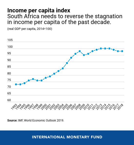
South Africa is a political miracle: a country which managed to negotiate its way peacefully to ending apartheid rule through a democratic election in 1994. After that, South Africa\’s economy mostly grew up until the Great Recession, but it has now been largely stagnant for a decade. Here\’s a figure from the IMF showing per capita GDP in South Africa since 1993. (Values are index numbers set relative to a value of 100 for 2014.)
Chart 4
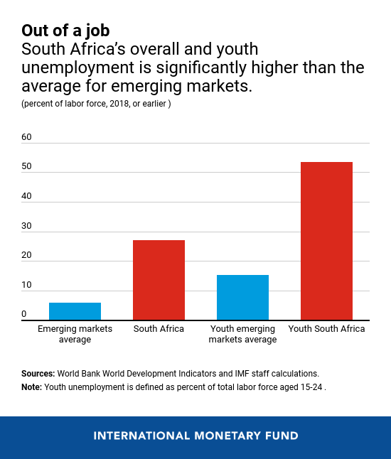
Other IMF stats show that overall unemployment is 25% and youth unemployment exceeds 50%. A combination of high-income cities like Johannesburg and Pretoria and low-income urban slums and rural areas have also combined to make South Africa one of countries with highest levels of income inequality.
Chart 5

The IMF just completed an evaluation of South Africa\’s economic situation a few weeks ago. Also, in August 2019, South Africa\’s Treasury department published a list of suggested reforms. What are some themes that emerge about what has gone wrong and what needs to be done?

1) Many of South Africa\’s state-owned enterprises (SOEs) seem to be in disastrous shape, and the biggest disaster is ESKOM, the electricity public utility. The IMF writes:

Most SOEs face elevated costs arising from bloated wage bills and costly procurement. Cost increases have outstripped tariff increases and cuts in capital expenditure, and debt service burden has risen, keeping SOEs net cash flows negative. Eskom is by far the largest SOE and its position is particularly critical, with an operational balance insufficient to service its high debt—around 10 percent of GDP. … Corruption, delays in debt-financed investments, and expensive procurement have generated cost-overruns and left Eskom reliant on outdated plants vulnerable to breakdowns (the average age of the fleet is 37 years). 

Other especially problematic state-owned enterprises are South African Airways and the passenger railway company PRASA.
2) In substantial part because of subsidies to the state-owned enterprises, South Africa\’s government is already running large fiscal deficits–which of course makes it difficult to focus resources on social spending. The IMF writes: 

In the early and mid-2000s, annual output growth averaged about 4 percent, fiscal deficits turned to small surpluses, and public debt declined to 27 percent of GDP. By contrast, starting in the late-2000s, private investment’s contribution to growth fell considerably, and total factor productivity (TFP) growth became negative, dampening growth to slightly above 1 percent. Following the countercyclical easing at the time of the global financial crisis, fiscal deficits have remained wide at around 4½ percent of GDP, more than doubling public debt to close to 60 percent of GDP. 

IMF projections are for the annual deficits to get higher, in substantial part because of promised subsidies to the state-owned enterprises, but also for paying interest on past borrowing–much of which is paid to international investors outside South Africa. 
3) Product markets in South Africa strongly favor large incumbent firms, and choke off new competitors. The IMF again: 

Several economic sectors, including manufacturing and banking, are dominated by a handful of big players with significant market power. High concentration has inhibited the emergence of smaller firms, which are powerful job creators in other EMs [emerging markets]. SMEs [small and medium enterprises] have shrunk in importance relative to large firms in the past decade. Staff analysis suggests that rising input costs and markups are associated with declining economic growth. This is clearly the case of large SOEs that pass-on high costs to businesses, thus sustaining elevated price
levels and reducing the economy’s competitiveness. Firms subject to restrictive procurement and labor regulations also suffer from high costs and low productivity. A distributional analysis suggests that the poor are more affected as they face both fewer employment opportunities and higher prices.

One striking comparison looks at \”mark-ups\” across countries–that is, how much are the prices that countries charge above marginal cost of production? Here\’s a study that looks at the change in mark-ups over time, compared to the rise in marginal costs.

Here\’s another figure looking at concentration in the retail industry, which is often an industry that can be friendly to new entrants. South African retail is far more concentrated than the comparison countries.

4) South Africa is experiencing a labor market mismatch, where much of the job growth is in higher-skilled jobs and much of the unemployment is among lower-skilled workers. Moreover, requiring that state-owned enterprises pay high wages means that these firms try not to hire lower-skilled workers. As the IMF writes:

South Africa has a higher level of unemployment and lower labor force participation than both regional and emerging economies. With skill mismatches and economic growth tilted toward the most sophisticated sectors (finance, information technology, and specialized business services), the bulk of job creation benefits high-skilled workers as opposed to low-skilled workers and labor-intensive industries including agriculture, tourism, and manufacturing. Further, labor cost increases exceed productivity improvements—largely a reflection of the centralized wage bargaining that transmits labor cost increases to the rest of the economy—systematically keeping demand for labor (including for new entrants) significantly below employment needs. Firm closures further worsen the dynamics. … Regulatory constraints that inhibit firms’ ability to hire on a need basis limit employment opportunity, particularly for the inexperienced and the youth. To justify payment of centrally bargained wage levels, firms prefer to hire skilled and experienced workers, who represent a small percentage of the population.

This is why one of the main recommendations from the report of South Africa\’s Treasury focuses on \”prioritizing labour-intensive growth in sectors such as agriculture and services, including tourism.\”

5) In the long run, a key element for South Africa will be its education system and other methods of getting future employees the skills they need. South Africa\’s education system is not performing well. From the IMF, here\’s a figure showing spending on education on the horizontal axis, and performance on the international PISA tests on the vertical axis. South Africa\’s performance lags far behind other countries with a similar level of spending.

The South African Treasury, before starting its discussion of reforming state-owned enterprises and all the rise, first emphasizes the importance of education in its  report:

However, any attempt to raise South Africa’s potential growth rate must include progress on the fundamental building blocks of long-run sustainable growth. First, there must be an emphasis on improving educational outcomes throughout the educational life-cycle … The South African education system, which other countries have used to promote equality of opportunity, perpetuates inherited socio-economic disadvantage: if your parents are poor, the chances of your being poor are about 90 per cent (Finn et al. 2016). The lack of a transformative education system is a key factor in this persistence. Our educational outcomes are poor, even when compared to other less well-resourced countries in the region. This is a major driver of intergenerational inequality and inhibits the inclusivity of growth and global competitiveness. Since the highest return to human capital investments are associated with the earliest interventions, an educational life-cycle approach must include a strong emphasis on early childhood development, which has demonstrated the ability to: (i) improve long-term health outcomes (Campbell et al. 2014); (ii) boost earnings by as much as 25 per cent (Gertler et al. 2014); and (iii) generate a rate of return on investment of 7 to 10 per cent through better outcomes in education, health, and productivity (Heckman et al. 2010). Evidence of inadequate
teacher content knowledge (see Venkat and Spaull 2015) and significant reading deficits in primary schools (see Spaull and Kotze 2015) points to the need for a comprehensive reading plan for primary school learners drawing on successful experiences such as the provision of reader anthologies.

Second, we need to continue to implement youth employment interventions, including training opportunities that remove barriers to entering the labour market and apprenticeships based on close cooperation between technical, vocational, and other training institutions and the private sector to ensure that training needs are demand-driven (Bhorat et al. 2014). Investing in the capabilities and educational and health outcomes of young people is unlikely to yield a dividend unless the youth are absorbed by labour markets (Mlatsheni 2014). 

6) A separate report from the IMF also added a discussion of the problem of crime in South Africa. For illustration, here\’s the homicide rate in South Africa, which has dropped a bit since 2000 but remains very high.

Surveys of business in South Africa see the crime rate as one of the biggest problems.

International comparisons of businesses also suggest that crime is a particular problem in South Africa.

Overall, the in-depth discussion of policy steps by South Africa\’s Treasury sums up this way:

These growth reforms are organized according to the following themes: (i) modernizing network industries; (ii) lowering barriers to entry and addressing distorted patterns of ownership through increased competition and small business growth; (iii) prioritizing labour-intensive growth in sectors such as agriculture and services, including tourism; (iv) implementing focused and flexible industrial and trade policy; and (v) promoting export competitiveness and harnessing regional growth opportunities. We estimate the economy-wide impact of the proposed interventions over time based on when they can realistically be implemented, and find they can raise potential growth by 2–3 percentage points and create over one million job opportunities.

There used to be a hope that South Africa\’s economy could provide provide both an example and an engine for lifting standards of living across sub-Saharan Africa. Back around 1995, for example, South Africa had about 7% of the total population of sub-Saharan Africa, but the GDP of South Africa was about one-third of total GDP for the region. By 2018, however South Africa had about 5% of the population of sub-Saharan Africa, but 21% of the total GDP of sub-Saharan Africa. The blunt truth seems to be that South Africa\’s government has not delivered in the last decade on many important outcomes: not in education and training, running state-owned enterprises, providing a climate for new businesses to start, not in reducing inequality, getting crime under control, or keeping government debt manageable.

Global R&D:The Stagnant US Position

Research and development isn\’t enough by itself. . New discoveries needs to be brought into the economy in the form of new companies, new products, and new jobs. But it matters. A long-standing concern among economists is that a market-oriented economy may tend to underinvest in R&D, because even with intellectual property like patents and trade secret law, an innovator captures on average only a modest share of the social benefits from R&D. Thus, a variety of estimates suggest that the social return from more R&D spending is 60%, or that the US should be aiming over time to double its R&D spending

In a global context, the US efforts to invest in R&D look stagnant. Here are some figures from a January 2020 report of the National Science Foundation and the National Science Board, called \”The State of U.S. Science & Engineering 2020,\” 

This figure shows total domestic spending on R&D (government, private-sector, nonprofits). The US leads the way. The purple line is China, which surpassed Japan about a decade ago and Europe about five years ago.
If you look at the growth rate of R&D from 2000-2017, you can see that the China is the most obvious area catching up to the US, but certainly not the only one.  
As a result of these ongoing shifts, the US used to be the preeminent region for R&D spending. But now, the the primary geographical  home of most global R&D is the East and South Asia region.
One issue is that the US spends about 2.5% of GDP on R&D in most years, give or take a few tenths of a percent. Germany, Japan, and South Korea spend more. China spends a lower share of GDP on R&D, but the share has been rising and of course China\’s GDP has also been growing quite rapidly in recent decades. 


In the US, government spending on R&D has been pretty flat for the last decade or so; instead, it has been business spending on R&D leading the way. Business involvement in R&D spending is clearly a good thing, because it suggests that business are seeing ways to bring new discoveries into the day-to-day operations. However, there are also concerns that when it comes to research and development, business can be heavier on the \”D\” and lighter on the \”R.\” The giant corporate laboratories of the past like AT&T\’s Bell Labs, Xerox\’s Palo Alto Research Center, IBM\’s Watson Labs, and DuPont\’s Purity Hall have diminished in scope or closed altogether. Relatively few modern companies finance research in basic science, or in long-horizon, high-risk projects that may turn out to be central to whole new industries.


When confronted with these kinds of issues, a standard US response is to raise suspicions that the quality of R&D being done in China or across other countries of east and south Asia may not be very high. It\’s of course hard to measure the quality of research, but one method is to look at whether research articles are heavily cited by follow-up research. The NSF report explains: 

The impact of an economy’s S&E [science & engineering] research can be compared through the representation of its articles among the world’s top 1% of cited articles, normalized to account for the size of each country’s pool of S&E publications. This normalized value is referred to as an index and is similar to a standardized score. For example, if a country’s global share of top articles is the same as its global share of all publication output, the index is 1.0. The U.S. index was 1.9 in 2016, meaning that its share of the top 1% of cited articles was about twice the size of its share of total S&E articles (Figure 22). Between 2000 and 2016, the EU index of highly cited articles grew from 1.0 to 1.3 while China’s index more than doubled, from 0.4 to 1.1, indicating rising impact from both areas.

In short, this metric suggests that US research efforts are more likely to be in the top 1% of the research literature. It also suggests that the gap is closing.

I often see proposals for the US to focus on building its transportation infrastructure, like roads, bridges, railroads, and airports. One can certainly make a reasonable case for such investments. But I also suspect that transportation spending is not going to be the main driver for leading global economies for the remaining four-fifths of the 21st century. A serious national conversation on how best to expand US R&D spending substantially is overdue. 

Interview with Janice Eberly: Intangible Capital and Other Topics

Jessie Romero has an interview with Janice Eberly in Econ Focus (Federal Reserve Bank of Richmond, Fourth Quarter 2019, pp. 22-26). The introduction notes: \”Her research covers topics including firms\’ capital investment decisions, household consumption choices, and how these decisions influence, and are influenced by, macroeconomic trends. Most recently, Eberly has been studying the implications of rising `intangible investment\’ — the investments firms make in software, intellectual property, and the like — for aggregate investment, market concentration, and productivity growth.\”

The topic of intangible capital is still very much a subject of live research, not as settled question. But it offers the potential to be an explanation for some otherwise puzzling patterns in the modern economy. For example, US investment spending in physical capital has is low, which seems strange in an economy which \”everyone knows\” is moving toward a greater focus on technology. Maybe investments in intangible capital can help explain why? Physical capital can help produce up to a certain amount, bur then runs into physical limits. However, intangible capital may be able to expand output to much higher levels without running into physical limits. If some firms are going better at intangible capital investments than others, this could help to explain the rise of \”superstar\” firms. Here are some comments from Eberly in the interview:

We\’re familiar with investments in physical capital, by which I mean property, plant, and equipment — the things most people would recognize as capital. That\’s tangible capital. But today we also have intangible capital — the investments you can\’t touch, such as software and intellectual property. You can expand the definition to include things like worker skills that are specific to the firm; when a firm invests in its employees, it\’s also developing its capital in some broad sense. The metaphor we often use is that Amazon\’s software platform is as crucial for its business model as an oil platform is for an energy extraction firm.

These types of investments are increasingly important: Intangible capital is the fastest-growing part of investment. It also seems to be playing a greater role in the success of firms. Not only is intangible capital a larger and larger share of investment overall, but it\’s also especially important for the firms that end up being the leading firms in their industries.

Amazon\’s business is built on intangible capital; Walmart\’s logistics technology is all intangible capital. Retail is a sector where efficiency has risen dramatically and labor productivity has gone up. This is very highly associated with the increase in intangible capital, so in retail especially you see a very strong role for intangible capital among the most successful firms. …

Intangible capital seems to be where firms\’ innovative investments are reflected. Historically, we thought technological change was embodied in tangible capital: When firms put new equipment in place, it came with new software and new capabilities. So a way of increasing productivity was to put new equipment in place. Today, you can buy the software separately. So the question is whether physical capital is embodying technological change in the way that it used to. Is the technological change actually in the intangible capital? …

Intangible capital does seem less sensitive to traditional monetary policy. It tends to depreciate quickly, and it\’s not an interest-rate-sensitive spending category. That tends to make it less responsive to monetary policy that moves interest rates.

Financial innovation could reverse that effect, though. If intellectual property was \”financialized,\” for example, becoming more like liquid assets, you could definitely see credit markets arising behind intangible capital, as there are for machinery and equipment. Now, intangible capital tends to be embedded in a firm. But there are new markets developing all the time that could make intangible capital more marketable. There are already markets for some types of intangible capital — patents can be bought, sold, and licensed, for example. …

Just like job growth has shifted toward the service jobs you can\’t send overseas, investment has shifted toward the industries where you can\’t offshore the capital and away from the durable goods and manufacturing industries. The curious thing was that we saw job growth in the high-skilled, high-tech sectors, but we didn\’t see the counterpart in investment growth. We saw the hollowing out of investment away from manufacturing, but we didn\’t see it going toward high-tech. This was my first inkling that something was going on with investment that was different from what we\’d seen historically. The physical capital was the dog that didn\’t bark.

But high-tech is where there\’s been a big increase in intangible capital. So when you add that in, you do see a rise in not only high-tech jobs, but also high-tech investment — it\’s just that the high-tech investment is not the tangible kind.

For those interested in digging into the underlying research, a good starting point is \”Understanding Weak Capital Investment: the Role of Market Concentration and Intangibles,\” by Nicolas Crouzet and Janice C. Eberly (NBER working paper from May 2019 is here; for an earlier ungated version from the Kansas City Fed, see here). From the abstract:

We document that the rise of factors such as software, intellectual property, brand, and innovative business processes, collectively known as “intangible capital” can explain much of the weakness in physical capital investment since 2000. Moreover, intangibles have distinct economic features compared to physical capital. For example, they are scalable (e.g., software) though some also have legal protections (e.g., patents or copyrights). These characteristics may have enabled the rise in industry concentration over the last two decades. Indeed, we show that the rise in intangibles is driven by industry leaders and coincides with increases in their market share and hence, rising industry concentration. Moreover, intangibles are associated with at least two drivers of rising concentration: market power and productivity gains. Productivity gains derived from intangibles are strongest in the Consumer sector, while market power derived from intangibles is strongest in the Healthcare sector.

I recommend the rest of the Eberly interview as well. As one example, I was intrigued by one of her comments about student loans: 

What everyone notices when you look at the student loan data is this increase in loans outstanding over the course of the 2000s. Then it accelerates during the financial crisis. … There\’s a generational switch: The financial responsibility for education is being transferred from the parents to the students. When the parents lost access to home equity, they reduced spending on many things, but they reduced their spending on education more than on other parts of their budget. The student loans help the family to insure the student\’s education, but there\’s a reallocation of consumption within the family as well.

So far, the switch hasn\’t reversed. So there does seem to be a longer-run shift toward students self-financing their educations. Some of that is a change in the composition of the student body, so you\’re seeing more students who are self-funding.

Do Americans Think Science is Moving Too Fast?

One tension of modern life is that we love new technology when it makes our lives easier, more fun, safer, or healthier, but we hate new technology when certain familiar skills, accustomed habits, favorite consumables and even our jobs become outdated–and we are forced to change. So how to American view science overall. Here are a couple of figures from The State of U.S. Science and Engineering 2020, by Beethika Khan, Carol Robbins, and Abigail Okrent, just published by the National Science Foundation and the National Science Board (January 2020).

This figure shows responses to four questions. There is 80+% agreement that government should fund basic research, and 90% agreement that science generates opportunities for the next generation, and both sentiments seem to have risen a bit in the last 20 years. On the other side, about 50% of Americans say that \”science makes life change too fast\” and less than 50% \”have a great deal of confidence in the scientific community.\”

One might sum this up by saying that Americans recognize the importance of science in the abstract, but when it comes down to their own daily lives or to actual scientists, they are more skeptical.

Another figure shows a breakdown by education level to these questions. The results are mostly predictable: that is, more education generally makes you more likely to believe science is important, to support government funding for science, and to express confidence in scientists.

But it\’s interesting to note on the question of whether \”science makes life change too fast,\” the skepticism for those with graduate or professional degrees is higher than for those with some college or a bachelor\’s degree.

I have my days and times, like everyone else, when new technology adds stress to my life. I feel a lot of sympathy for people whose employers or jobs are eliminated with the arrival of new technology. But from a broad social point of view, embracing the new opportunities of science and technology is extraordinarily important. Issues ranging from better-paid jobs, effective  health care at moderate cost, widespread access to education and training, environmental protection, and many other desirable outcomes are much more likely to be achieved if science and technology keep moving forward in useful directions. Also, many other nations and workforces around the rest of the world want science and technology to make life change even faster, and they are moving in that direction.

Where US Spending, Taxes, Deficits: Looking Back 50 Years

Of course, there\’s nothing sacred about looking at average levels over the past 50 years of government spending, taxes, and deficits. But it does at least offer some historical perspective. The CBO report, \”The Budget and Economic Outlook: 2020 to 2030\” (January 2020) gives a look at where the federal budget has been, and a defensible if probably understated look at where it\’s currently headed.

To me, one of the striking facts about the federal budget over the last half-century that you wouldn\’t necessarily guess from the political rhetoric is that it has been so stable. The figure shows federal taxes and spending as a share of GDP since 1970, and the projected out to 2030.

Federal taxes have averaged 17.4% of GDP during that time, and looking at the last 50 years, it\’s been fairly close to that level most of the time. It surges higher in the late 1970s, when inflation was pushing people into higher tax brackets (because tax brackets weren\’t yet adjusted for inflation). It surges higher in the late 1990s, with the boost from higher stock prices and capital gains in the dot-com economy. Taxes drop in the aftermath of the dot-com bust in the early 2000s, and drop when the economy slows in the Great Recession. Still, given all the economic and political changes from 1970 to 2020, and all the complaints about how federal taxes are becoming increasingly burdensome, it\’s striking to me that the federal tax take tended to grow over the long term pretty much in synch with the rest of the economy.

There is one discordant note for the stability of federal tax revenues over time, and it relates to the current tax take and the predictions for the next few years. The usual pattern is that federal tax revenues rise and are above-average during good economic times when incomes are growing, while federal tax revenues fall and are below-average during recessions when the economy shrinks. But in early 2020, the last recession ended more than a decade ago and unemployment rates are at their lowest in 50 years. The CBO projections use a default prediction of a steady-state economy for the next few years. Thus, one would expect federal taxes to be higher than the long-run average now and in the next few years, not below.

On the spending side, the continuity is again striking to me, given the complaints one years about  how federal spending has either exploded in size or been slashed into austerity. The half-century average is 20.4% of GDP. Spending is higher in big recessions, like the early 1980s or the Great Recession, and it\’s lower during times of economic booms, like the 1990s. But given all the shifts in federal spending from 1970 to 2020–say, the fall in defense spending as a share of GDP, the creation of Medicare, and now the swelling retirements of the \”baby boom\” generation–the overall stability is remarkable.

Again, there is a mildly discordant note in the present. The current economy is healthy enough that it would seem more plausible for federal spending to be below it\’s long-run average, now and in the next few years, but instead it is already a little above it\’s long-run average, and headed higher.

Putting together the tax and spending leads to budget deficits and surpluses. As the figure shows, the average US budget deficit over the last 50 years has been 3.0% of GDP. The projected deficits for the next decade average 4.8% of GDP–and remember, this is based on the assumption that the economy continues to grow without a recession and with continuing low unemployment (specifically, a rise to 4.4% later in the 2020s) continuing through the decade.

The CBO is constrained by law to make its predictions under the assumption that current legislation will take effect on time and on schedule, which means that its tax revenue estimates are prone to overstatement while its spending numbers are prone to understatement. For example, a big chunk of the predicted rise in tax revenues during the 2020s is that parts of the 2017 tax cut, under current law, expire in 2025. The law was designed that way, so that the long-term projected revenue loss would be limited. But whether those tax cuts are actually allowed to expire is a political decision, and I\’m already hearing some noises about extending the tax cuts further.

On the spending side, the main reasons driving higher spending from 2020 to 2030 are related to rising costs for Social Security and for the major federal health care programs like Medicare, Medicaid, tax credits for health insurance, and the Children\’s Health Insurance Program are already large–given that several of these programs are spending more as the boomer generation retires–and projected to keep rising.

The other big area of rising federal spending is interest payments on past government borrowing. This graph shows the pattern of federal budget surpluses and deficits (as earlier) with the solid black line, but now the deficit/surplus is divided into the \”primary\” deficit, which doesn\’t include interest payments, and the interest payments are shown separately.   

Net interest payments were 1.3% of GDP back in 2010, 1.7% of GDP in 2020, and projected for 2.6% of GDP in 2030. To put this in some perspective, the projected spending on interest payments in 2030 will be twice as much as the projected revenue from the corporate income tax in 2030, and slightly higher than projected Medicaid spending in 2030. 

Looking at the projected deficits over time leads to projections for the accumulated federal debt. This graph extends to 2050. In 10 years, the projected federal debt (under the probably conservative CBO assumptions is 98% of GDP, roughly similar to the previous debt-to-GDP high at the end of World War II.  The projected federal debt keeps rising after that, in part because higher interest payment feed on the higher debt, which in turn leads to still-higher interest payments.

There\’s no hard-and-fast rule as to when government debt becomes too heavy a burden or too severe a risk. The mighty US economy isn\’t Greece or Argentina, but neither is it invulnerable to the tradeoffs of needing to commit ever-additional resources to paying interest on past debt, or the risk that government borrowing may grow large enough that private-sector borrowing is crowded out, or that at some point in the next few decades, investing in US debt may look more risky than it appears today. At a minimum, it\’s undeniably true that annual US deficits as a share of GDP are projected to be well above their historical levels in the next decade, and the accumulation of US debt as a share of GDP, based on current law, is headed for uncharted territories.

How US Science and Engineering Depends on Immigrants

Every other year, the National Science Foundation is required to publish a \”Science and Engineering Indicators\” report. For the January 2020 version, the NSF went with a summary report, called \”The State of U.S. Science & Engineering 2020,\” which is then accompanied by seven more detailed reports. Here, I\’ll focus on some evidence from the overview report on the subject of how the US science and engineering workforce depends on immigrants, both as worker and also as students in its higher education system.

Foreign-born workers—ranging from long-term U.S. residents with strong roots in the United States to more recent immigrants—account for 30% of workers in S&E occupations. The number and proportion of the S&E workforce that are foreign born has grown. In many of the broad S&E occupational categories, the higher the degree level, the greater the proportion of the workforce who are foreign born. More than one-half of doctorate holders in engineering and in computer science and mathematics occupations are foreign born (Figure 9).

Within the US higher education system, a disproportionate number of the science and engineering degrees go to immigrants–many of whom then remain in the US economy at least for a time

In the United States, a substantial proportion of S&E doctoral degrees are conferred to international students with temporary visas. In 2017, temporary visa holders earned one-third (34%) of S&E doctoral degrees, a relatively stable proportion over time. They account for half or more of the doctoral degrees awarded in engineering, mathematics and computer sciences, and economics. Three Asian countries—China, India, and South Korea—are the largest source countries and accounted for just over half (54%) of all international recipients of U.S. S&E research doctoral degrees since 2000. By comparison, students on temporary visas earn a smaller share (6% in 2017) of S&E bachelor’s degrees. However, the number of these students has more than doubled over the past 10 years.

A majority of the S&E doctorate recipients with temporary visas—ranging between 64% and 71% between 2003 and 2017—stayed in the United States five years after obtaining their degree. Those from China and India, however, saw a decline in their respective “stay rates” from 93% and 90%, respectively, in 2003 to 84% and 85%, respectively, in 2013; the rates remained stable from 2013 through 2017. The stay rate increased for those from South Korea (from 36% in 2003 to 57% in 2017). Stay rates also vary by field of doctoral degree. Among S&E doctorate recipients, social sciences (52%) has a lower stay rate than the average across all fields (71% in 2017).

I know that we live in times of substantial concern about how technology may be transferred from the United States to other countries. Whatever one\’s concerns in that area, there is also another side to consider, which is that in raw numerical terms the US has a heavy dependence on imported science and engineering workers and American universities in science and engineering fields maintain their status and preeminence thank in substantial part to their foreign students. 

The NSF report also points out that when it comes to sheer numbers of science and engineering degrees, the dominant position of the US and European economies is eroding. For example, here are the trends in the number of university degrees  given in science and engineering. That rising purple line is the total for China, taking off. Concerns are sometimes raised that a number of these degrees in China may not represent especially high quality achievement in learning. But the sheer numbers are nonetheless striking–and the quality does seem to be improving over time. 
A similar if less vivid trend is apparent in granting of doctoral degrees in science and engineering fields. Here, the large EU economies have a lead compared to the US, with China and India rising rapidly
The economic competitiveness of nations is built to a substantial extent on the talents of their workforce.  It seems likely that future economic growth for the US and other advanced economies will depend heavily on the industries built on advances in science and engineering. One of the great competitive advantages for the US economy has been that its education system, economy, and society are attractive and open to so many workers and students from around the world with skills in these areas.