The US Productivity Slowdown After 2005

In the long run, a rising standard of living is all about productivity growth. When the average person in a country produces more per hour worked, then it becomes possible for the average person to consume more per hour worked. Yes, there is a meaningful and necessary role for redistribution to the needy. But the main reason why societies get rich is by redistributing more: rather, societies are able to redistribute more because rising productivity expands the size of the overall pie. 

In the latest issue of the Monthly Labor Review from the US Bureau of Labor Statistics, Shawn Sprague provides an overview in \”The U.S. productivity slowdown: an economy-wide and industry-level analysis\” (April 2021). In particular, he is focused on the slowdown in US productivity growth since 2005, after a resurgence of productivity growth in the previous decade. Here\’s a figure showing the longer-run patterns, which have birthed roughly a jillion research papers. 

Notice that total productivity growth is robust in the decades after World War II, from 1948 to 1973. Then there is a productivity slowdown, especially severe in the stagflationary 1970s, but continuing through the 1980s and into the 1990s. There\’s a productivity surge from 1997 to 2005, commonly attributed to acceleration in the power and deployment of computing and information technology. But just when it seemed as if the economy might be moving back to a higher sustained rate of productivity growth, then starting around 2005, productivity sagged back to the levels of the slowdown in the 1970s and 1980s. 
The figure also shows how economists break down sources of economic growth. First look at how much the quality of the labor force has improved, as measured by education and experience. Then look at how much capital the average worker is using on the job. After calculating how much productivity growth can be explained by those two factors, what is left over is called \”multifactor productivity growth.\” This is often interpreted as changes in technology–broadly understood to include not just new inventions but all the ways that production can be improved. But as the economist Moses Abramowitz said years ago, measuring multifactor productivity growth as what is left over, after accounting for other factors, means that productivity growth is \”the measure of our ignorance.\”

As Sprague points out, variations in multifactor productivity growth are the biggest part of changes in productivity over time. 

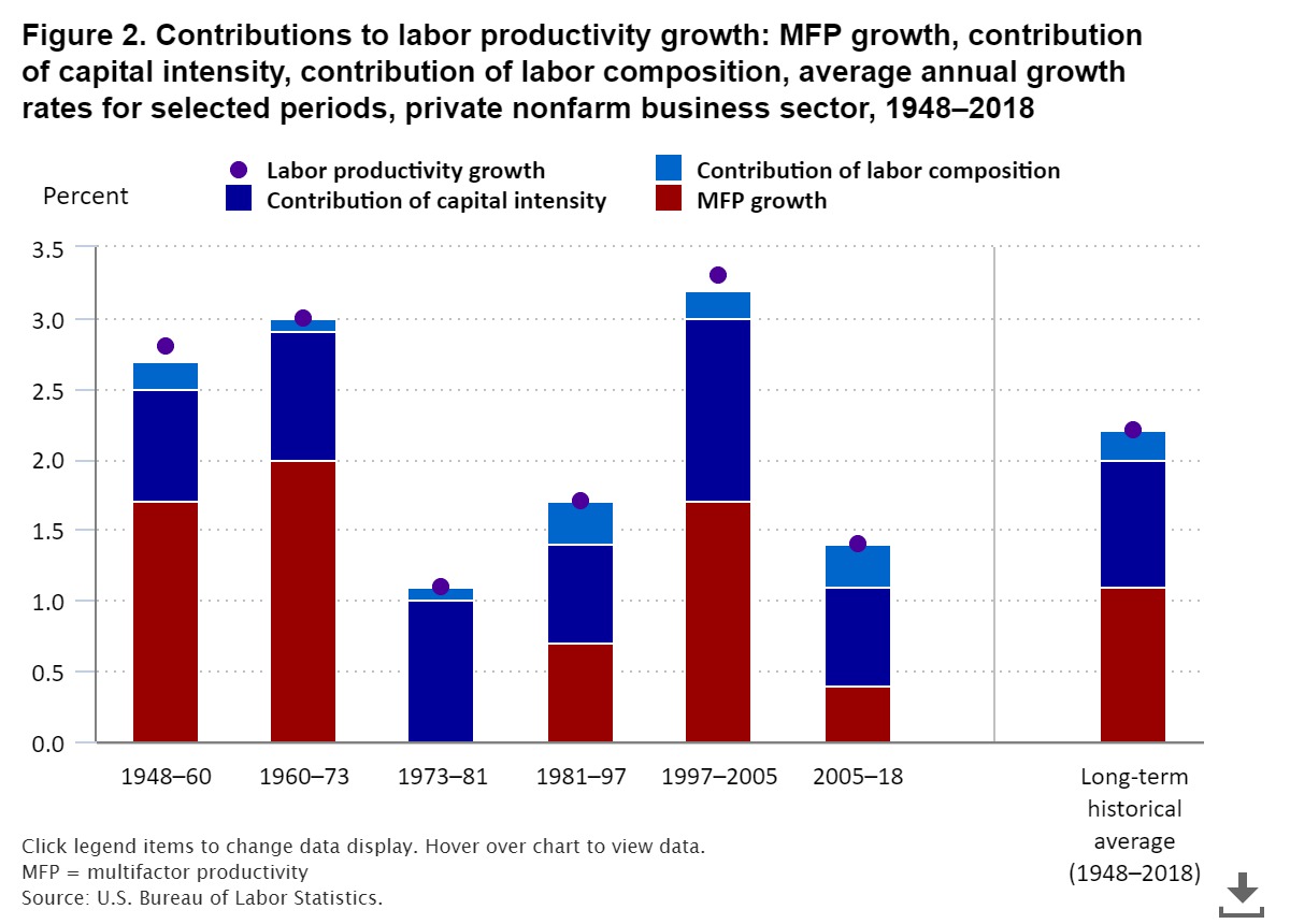
The deceleration in MFP growth—the largest contributor to the slowdown—explains 65 percent of the slowdown relative to the speedup period; it also explains 79 percent of the sluggishness relative to the long-term historical average rate. The massive deceleration in MFP growth is also emblematic of a broader phenomenon shown in figure 2. We can see that throughout the historical period since WWII, the majority of the variation in labor productivity growth from one period to the next was from underlying variation in MFP growth, rather than from the other two components.

However, the most recent slowdown in productivity also seems to have something to do with capital investment. Sprague again: 

At the same time, in addition to the notable variation in MFP growth during the recent periods, something unprecedented about these recent periods was the additional contribution from variation in the contribution of capital intensity. The contribution of capital intensity had previously remained within a relatively small range (0.7 percent to 1.0 percent) during the first five decades of post-WWII periods, but then in the 1997–2005 period, the measure nearly doubled, from 0.7 percent up to 1.3 percent, followed by nearly halving to 0.7 percent in the 2005–18 period. … The contribution of capital intensity accounts for 34 percent of the labor productivity slowdown relative to the speedup period and explains 25 percent of the sluggishness relative to the long-term historical average rate.

What are some possible explanations for the growth slowdown? As Sprague writes: [N]not only has the productivity slowdown been one of the most consequential economic phenomena of the last two decades, but it also represents the most profound economic mystery during this time …\” Sprague does a detailed breakdown of economy-wide factors that may have contributed to the productivity slowdown as well as industry-specific factors. Here, I\’ll just mention some of the main themes. 
A first set of explanations focus on the Great Recession, and the sluggish recovery afterwards. One can argue, for example, that when the financial sector is in turmoil and an economy is growing slowly, firms have less ability and less incentive to raise capital for productivity gains. This seems plausible, and surely has some truth in it, but it also has some weak spots. For example, the productivity slowdown in the data pretty clearly starts a few years before the Great Recession. Also, one might argue that in difficult times, firms might have more incentive to seek out productivity gains. Finally, it feels like a circular argument to ask \”why aren\’t additional inputs producing output gains as large as before?\” and then to answer \”because the output gains were not as large as before.\” 
A second explanation is that productivity gains at the frontier have not actually slowed down: instead, what has slowed down is the rate at which these gains are diffusing to the rest of the economy. From this point of view, the real news is a wider dispersion in productivity growth within industries, as productivity laggards fall farther behind leaders (for discussion, see here and here). At a more detailed level, \”not many of the firms that have been innovating have not similarly been able to scale up and hire more employees commensurate with their improved productivity.\” It could also be that there are certain characteristics of productivity growth leaders–like an ability to apply leading-edge information technology to business processes throughout the company–that are especially hard for productivity laggards to follow. This lack of reallocation in the economy toward high-productivity firms may be related to other prominent issues like a decrease in levels of competition in certain industries or rising inequality. 
A third explanation is that the productivity surge from 1997-2005 should be be viewed as a one-time anomalous event, and what\’s happening here is a long-term slowdown in the rate of productivity growth. Sprague writes: 

One underlying rationale for this potential story is provided by Joseph A. Tainter. This author offers that, in general, as complexity in a society increases following initial waves of innovation, further innovations become increasingly costly because of diminishing returns. As a result, productivity growth eventually succumbs and recedes below its once torrid pace: “As easier questions are resolved, science moves inevitably to more complex research areas and to larger, costlier organizations,” clarifying that “exponential growth in the size and costliness of science, in fact, is necessary simply to maintain a constant rate of progress.” Nicholas Bloom, Charles I. Jones, John Van Reenen, and Michael Webb offer supporting evidence for this view regarding the United States, asserting that given that the number of researchers has risen exponentially over the last century—increasing by 23 times since 1930—it is apparent that producing innovations has become substantially more costly during this period.

Again, this explanation has some plausibility. But it also feels as if the modern economy does have a substantial number of innovations,  and the puzzle is why they aren\’t showing up in the productivity statistics.
A fourth set of explanations digs down into which industries showed the biggest falls in productivity after 1995 and which ones showed the biggest rises. Here\’s an illustrative figure. The industries with the biggest losses are computers/electronics products, along with retail and wholesale trade. 

This selection of industries may feel counterintuitive, but remember that this is a comparison between two time periods. Thus, the figure isn\’t saying that productivity outright declined in these sectors–only that the gain after 2005 was slower than the gain in the pre-2005 decade. In computers, for example, rate of decline in  prices of microprocessors began to slow down in the mid-2000s. Similarly, retail and wholesale businesses underwent a huge change in the late 1990s and early 2000s that increased their productivity, but then the changes after that time were more modest.  In short, this is the detailed version industry-level version of the argument that the productivity rise from 1997-2005 was a one-time blip.

A final explanation, not really discussed by Sprague, is worth considering as well: Perhaps we are entering an economy where certain kinds of gains in output are not well-reflected in measured GDP gains. For example, imagine that the development of COVID-19 vaccines halts the virus. The social welfare gains from such vaccines are much larger than just the measured gains to GDP. Or imagine that a set of innovations makes it possible to reduce carbon emissions in a way that reduces the risk of climate change. From a social welfare perspective, this avoided risk would be a huge benefit, but it wouldn\’t necessarily show up in the form of a more rapidly expanding GDP. 
Or consider the range of online activities now available: entertainment, social, health, education, retail, working-away-from-the-office. Add in the services that are available at no direct financial cost, like email, software, shared websites, cloud storage, and so on. It seems plausible to me that the social benefits from this expanding set of options are much greater than how they are measured in GDP terms–for example, by how much I pay for my home internet service or how much ad revenue is taken in by companies like Google and Facebook. 

Again, this thesis has some plausibility. One never wants to fall into the trap of thinking that output as measured by GDP is also a measure of social welfare. It\’s well-known that GDP measures money spent on health care and money spent on environmental protection, but will have troubles measuring gains in actual health or the environment. GDP will often have a hard time measuring gains in variety and flexibility as well.  

But this set of explanations also raises issues of its own. It suggests that people may be experiencing gains in their standard of living that are not reflected in their paychecks. In contrast, when productivity gains in terms of output per worker slow down, we are talking about output as measured by what is bought and sold in the economy. In short, gains in measured productivity are what can help to produce pay raises. But if these other kinds of gains are meaningful, they can\’t be used to pay your rent or your taxes.  

Electrify Everything: Some Limitations of Solar and Wind

The \”electrify everything\” vision supports generating electricity in low-carbon or zero-carbon ways, and then also using electricity to replace other sources of energy like oil, coal, and natural gas–for example, by using cars powered by electricity rather than vehicles rather than by gasoline. It seems to me that some advocates of this vision are (implicitly) hoping that solar and wind power can meet most or all of future energy needs. That\’s not likely, as discussed in \”Clean Firm Power is the Key to California’s Carbon-Free Energy Future\” by Jane C.S. Long, Ejeong Baik, Jesse D. Jenkins, Clea Kolster, Kiran Chawla, Arne Olson, Armond Cohen, Michael Colvin, Sally M. Benson, Robert B. Jackson, David G. Victor, and Steven Hamburg (Issue in Science and Technology, March 24, 2021). 

Just to be clear, this group of authors can\’t be caricatured as naysayers on non-carbon energy. For example, two of the authors are scientists with the Environmental Defense Fund (Long and Hamburg). another is director of the Clean Air Task Force (Cohen), and another is co-director of the Deep Decarbonization Initiative (Victor). Others are researchers and scientists either in academia (including at Stanford and Princeton) or involved in green investment funds. The publication is published by the National Academies of Sciences, Engineering, and Medicine and Arizona State University.

They start with the fact that California has announced that it wants to have zero net emissions of carbon by 2045. This means not only having all electricity generated by non-carbon methods (rather than, say by natural gas or coal), but also following the \”electrify everything\” agenda so that electricity replaces fossils fuels for transportation, heating homes and buildings, and industrial uses. In short, total electricity output will need to double, and noncarbon energy sources will need to more than double. 

Can solar and wind handle this shift? The authors write: 

Groups from Princeton University, Stanford University, and Energy and Environmental Economics (E3), a San Francisco-based consulting firm, each ran separate models that sought to estimate not only how much electricity would cost under a variety of scenarios, but also the physical implications of building the decarbonized grid. How much new infrastructure would be needed? How fast would the state have to build it? How much land would that infrastructure require? …  Despite distinct approaches to the calculations, all the models yielded very similar conclusions. The most important of these was that solar and wind can’t do the job alone. …

Although the costs of solar and wind power are now fully competitive with other sources per kilowatt-hour, their inescapable variability creates reliability problems. Average daily output from today’s California solar and wind infrastructure in the winter declines to about a third of the summer peak. Periodic large-scale weather patterns extending over 1,000 kilometers or more, known as dunkelflaute (the German word for dark doldrums), can also drive wind and solar output to low levels across the region that can last days, or even several months. Average wind and solar outputs also vary from year to year, particularly for wind power.

What can be used to address this problem? One possibility is to store energy in batteries. But as the authors write: \”Better batteries play a key role in a carbon-free grid; they provide flexibility on hourly and diurnal time scales, for instance by saving some solar-generated electricity from late afternoon into the evening. But economical batteries cannot provide energy for weeks at a time.\” They point out that \”the largest battery storage facility in the world is being built at Morro Bay … and will be able to provide power for 4 hours, or 2.4 gigawatt-hours, enough to power 80,000 homes for about a day.\” But relying on solar and wind, together with battery storage, would require that California alone build hundreds of Morro Bay-sized batter facilities. 

Another possible back-up plan is to build large amounts of extra capacity for solar and wind power. Imagine that during certain times weather prevents solar from working well, and a given solar panel can generate only (say) one-tenth as much power as usual. But 10 times as many solar panels operating at a small fraction of their top power could make up the difference. The issue here is that there would be a huge and costly overcapacity of solar panel installations much of the time. Not only would building thos overcapacity of solar/wind (along with the additional required transmission liness) drive electricity costs up, it may not be physically possible. The authors write that this approach \”would require expanding solar capacity at a rate 10 times higher than has ever been done before. There may not be enough people, supplies, or land to do this.\” For example, investing in solar overcapacity in California means that \”more than 6,250 square miles of land would be required—bigger than the combined size of Connecticut and Rhode Island.\”

Thus, the results of this modelling drive the authors to the need for what they call \”clean firm power,\” by which they mean \” carbon-free power sources that can be relied on whenever needed, for as long as they are needed.\” 

Like what? One theoretical option would be to keep using natural gas for generating electricity, but combined with future generations of carbon capture and storage technology.  Another option is nuclear power. Geothermal energy is option that would work at certain locations in California. In other states, hydroelectric power might play a role. The researchers also mention the possibility of producing hydrogen from noncarbon sources.  

The authors aren\’t wedded to any particular source of \”clean firm power.\” But their calculations emphasize that even in a solar-friendly state like California, solar is only part of the answer to a low-carbon future and a willingness to rely on \”clean firm power\” will be needed, too.  

Dispose of Masks Properly, Or Else

II suppose it was pretty much inevitable that when a few billion disposable masks were distributed around the world in response to the pandemic, they would become a garbage problem, too. 

The first report I saw on this subject was called \”Masks on the Beach: The Impact of COVID-19 on Marine Plastic Pollution,\” by Teale Phelps Bondaroff  and Sam Cooke from a marine conservation nonprofit called OceansAsia (December 2020). They write:

The number of masks entering the environment on a monthly basis as a result of the COVID-19 pandemic is staggering. From a global production projection of 52 billion masks for 2020, we estimate that 1.56 billion masks will enter our oceans in 2020, amounting to between 4,680 and 6,240 metric tonnes of plastic pollution. These masks will take as long as 450 years to break down and all the while serve as a source of micro plastic and negatively impact marine wildlife and ecosystems.

Of course, the plastic in masks (and latex gloves and other personal protection equipment) is only a small proportion of overall plastic waste ending up in oceans.

Plastic production has been steadily increasing, such that in 2018, more than 359 million metric tonnes was produced. Estimates suggest that 3% of this plastic enters our oceans annually, amounting to between 8 to 12 million metric tonnes a year. This plastic does not ‘go away,’ but rather accumulates, breaking up into smaller and smaller pieces. Annually, it is estimated that marine plastic pollution kills 100,000 marine mammals and turtles, over a million seabirds, and even greater numbers of fish, invertebrates, and other marine life. Plastic pollution also profoundly impacts coastal communities, fisheries, and economies. Conservative estimates suggest that it could cost the global economy $13
billion USD per year, and lead to a 1-5% decline in ecosystem services, at a value of between $500 to $2,500 billion USD.

Articles in academic journals are now beginning to emerge that echo this point. For example, Elvis Genbo Xu and Zhiyong Jason Ren have written \”Preventing masks from becoming the next plastic problem\” in Frontiers of Environmental Science & Engineering (February 28, 2021, vol. 15, article #125). They write (citations omitted):

Face masks help prevent the spread of coronavirus and other diseases, and mass masking is recommended by almost all health groups and countries to control the COVID-19 pandemic. Recent studies estimated an astounding 129 billion face masks being used globally every month (3 million / minute) and most are disposable face masks made from plastic microfibers. … This puts disposable  masks on a similar scale as plastic bottles, which is estimated to be 43 billion per month. However, different from plastic bottles, ~ 25% of which is recycled, there is no official guidance on mask recycle, making it more likely to be disposed of as solid waste. … It is imperative to launch coordinated efforts from environmental scientists, medical agencies, and solid waste managing organizations, and the general public to minimize the negative impacts of disposal mask, and eventually prevent it from becoming another too-big-to-handle problem.

As another example, Auke-Florian Hiemstra, Liselotte Rambonnet, Barbara Gravendeel, and Menno Schilthuizen write about \”The effects of COVID-19 litter on animal life\” in Animal Biology (advance publication on March 22, 2021). They write (again, citations omitted): 

To protect humans against this virus, personal protective equipment (PPE) is being used more frequently. China, for example, increased face mask production by 450% in just one month. It is estimated that we have a monthly use of 129 billion face masks and 65 billion gloves globally. Similar to the usage of other single-use plastic items, this also means an increase of PPE littering our environment. PPE litter, also referred to as COVID-19 litter, mainly consists of single-use (usually latex) gloves and single-use face masks, consisting of rubber strings and mostly polypropylene fabric. Three months after face masks became obligatory in the UK, PPE items were found on 30% of the monitored beaches and at 69% of inland clean-ups by the citizen scientists of the Great British Beach Clean. Even on the uninhabited Soko Islands, Hong Kong, already 70 discarded face masks were found on just a 100-meter stretch of beach. A growing public concern about PPE litter became apparent during March and April 2020, as a Google News search on ‘PPE’ and ‘litter’ showed a sudden increase in news articles. As a response to the increase of COVID-19 litter, many states in the USA have raised the fines for littering PPE, sometimes up to $5500 as in Massachusetts. … While the percentage of COVID-19-related litter may be small in comparison with packaging litter … [b]oth masks and gloves pose a risk of entanglement, entrapment and ingestion, which are some of the main environmental impacts of plastic
 pollution …

It is striking that all the reported findings of entanglement, entrapment, ingestion, and incorporation of PPE into nests so far involved single-use products. Switching to reusables will result in a 95% reduction in waste …  To minimize the amount of COVID-19 litter and its effect on nature, we urge that, when possible, reusable alternatives are used.

I\’ll spare you the pictures of fish and wildlife tangled up in plastic masks and gloves, and just say it in words. Wearing a mask when in proximity to others was a reasonable step to take during this past year (as discussed here and here). But disposing of masks properly matters, too.

Evolving Patterns of Innovation Across States and Industries

Patents are an imperfect measure of innovation, but they can nonetheless convey the underlying story. 
Jesse LaBelle and Ana Maria Santacreu offer some interesting descriptions of how patent patterns changed between the 1980s and the 2000s in \”Geographic Patterns of Innovation Across U.S. States: 1980-2010 (Economic Synopses, Federal Reserve Bank of St. Louis, 2021, #5). 

To interpret these figures, it\’s important to know that new patents granted each year have been rising substantially over time, from about 40,000 in 1980 to 110,000 in 2010. Here\’s a figure showing the distribution of patents by US state: the top panel shows the 1980s, and the bottom panel shows the 2000s (that is, 2000-2010). Given that overall patent levels have risen, the figure shows many more states with higher patent levels (shown by the darker color). 

The two figures also show a geographic shift in the patterns of innovation. The authors write: 

In the 2000s, patent creation was concentrated mostly in three regions:

  • Northeast: New York, New Jersey, Delaware, and the New England states
  • West Coast: Oregon, Washington, Idaho, and California
  • Rust Belt: Minnesota, Illinois, Michigan, Ohio, and Pennsylvania.

Together, these states accounted for about 67 percent of total patents granted in the 2000s. While the East and West Coast states specialized in the computers and electronics sector, the Rust Belt states specialized in the machinery sector. These two sectors were the most innovative, based on the numbers of patents granted. The least innovative states were Mississippi, Arkansas, and Alaska. The rate of patent creation in the most innovative state was 22 times larger than in the least innovative state.

Here\’s a figure looking at patents by industry. Again, be cautious in comparing the top and bottom panels because the total number of patents has risen (as shown in the horizontal axis). But it is striking that in the 1980s, the distribution of patents across industries covered a reasonably wide spectrum. By the 2000s, patent activity had become much more concentrated in the \”Computer and electronic products\” sector.  

It\’s interesting to speculate about why patents have become more concentrated in one sector. Surely part of the reason is just the enormous technological gains made in computers and electronic products. But it\’s also possible that powerful companies in these industries are generating and buying patents as part of a \”patent thicket\” strategy to limit competitors, and it\’s possible that venture capitalists are more willing to support computer and electronics companies because of the possibility of lower costs and faster payoffs in this industry. For the large and diverse US economy, it seems important to have a very wide portfolio of efforts aimed at new technologies and innovation. 

Policy for the Next Pandemics

After a year of pandemic, one of the last topics I want to think seriously about is a future of pandemics. But with pandemics as with so many other problems, not thinking about it doesn\’t make it go away. Monica de Bolle, Maurice Obstfeld, and Adam S. Posen have edited a short 12-chapter e-book titled Economic Policy for a Pandemic Age: How the World Must Prepare (Peterson Institute for International Economics, April 2021). The book considers the discomfiting possibilities that COVID-19 may be a chronic pandemic for some time to come and what lessons might be learned for future pandemics. 

Several of the essays warn about the emergence of COVID variants around the world, including the UK, Brazilian, and South African variants that are known, but quite possibly others variants that are not yet known. Chad P. Bown, Monica de Bolle, and Maurice Obstfeld tell the story of the Brazilian city of Manaus in their essay, \”The pandemic is not under control anywhere unless it is controlled everywhere.\”

Manaus, a city on the Amazon River of more than 2 million, illustrates the dangers of complacency. During the first wave of the pandemic, Manaus was one of the worst-hit locations in the world. Tests in spring 2020 showed that over 60 percent of the population carried antibodies to SARS-CoV-2. Some policymakers speculated that “herd immunity”—the theory that infection rates fall after large population shares have been infected— had been attained. That belief was a mirage. A resurgence flared less than eight months later, flooding hospitals suffering from shortages of oxygen and other medical supplies. The pandemic’s second wave left more dead than the first. 

Scientists discovered a novel variant in this second wave that went beyond the mutations identified in the United Kingdom and South Africa. This new variant, denominated P.1, has since turned up in the United States, Japan, and Germany. Scientists speculate that a high prevalence of antibodies in the first wave may have helped a more aggressive variant to propagate. The hopes for widespread herd immunity may be dashed by the emergence of more infectious virus variants.

Since the outbreak in Manaus in January 2021, P.1 has now spread throughout Brazil. The variant is much more transmissible than those that had been circulating previously in the country. High transmissibility and the absence of measures and behaviors to stem the dissemination of the virus have led to the worst health system collapse in Brazilian history.

What are some of the lessons that emerge from thinking about the pandemic and its global scope? Here are a few that come up repeatedly in the book. 

1) It seems important to have coordinated collection of genomic data on COVID or other viruses, both within countries and around the world. That\’s how you know if you are dealing with an existing problem or a new one–and if it\’s a new one, you can start the process of getting appropriate tests and vaccinations up and running. 

2) If you want to stop a pandemic early, before you need to do large-scale long-term lockdowns or watch people die while a vaccine is being developed and tested, the alternative involves lots of testing and follow up.  Martin Chorzempa and Tianlei Huang describe this alternative in \”Lessons from East Asia and Pacific on taming the pandemic.\”

Bloomberg News’ COVID Resilience Rankings evaluate success in handling the pandemic while minimizing the impact on business and society. An astounding ten of the top 15 countries and territories are in East Asia and Pacific. Top performers vary enormously in size, wealth, and political institutions, from small, wealthy, democratic islands like Taiwan and New Zealand to large, middle-income countries under one-party rule like mainland China and Vietnam. Core to their exemplary performance was the use of targeted and less costly mitigation measures that do not require an economic freeze. … The experience in East Asia and Pacific varies among countries with diverse cultures, geographies, and political systems, but one thing is clear: rigorous masking requirements, testing, contact tracing, selective quarantines, border closings, and clear public health communication all helped to avoid the overwhelming economic dislocations that occurred in the West. …

One of the most crucial advantages in the early days of a pandemic is testing capacity, which helps identify both individuals to quarantine and where to focus further testing. The contrast between the United States and South Korea, for example, is instructive. Drawing on memories from the MERS outbreak in 2015, South Korean officials pushed for quick approvals of promising tests from multiple manufacturers even before their effectiveness could be rigorously proven. The US Centers for Disease Control and Prevention (CDC) and the Food and Drug Administration (FDA) required lengthy processes that limited testing supply, blinding their officials to the pathogen’s spread. By March 2020, South Korea had tested 31 times more people per capita than the United States, allowing it to catch many more cases and nip transmission chains in the bud.

The inability of the US to choose widespread testing and follow-up was in substantial part due to failures of those at the Centers for Disease Control and the Food and Drug Administration: for a discussion, see the article from a year ago in the Washington Post, \”Inside the coronavirus testing failure: Alarm and dismay among the scientists who sought to help.\”

3) Most US vaccination efforts happen as part of regular health care, delivered during regular visits to doctors. We need to learn more about the most effective ways of widespread distribution of a vaccine during a pandemic. 

In many places, including where I live in Minnesota, the primary method of vaccine distribution for the general non-institutionalized population happens in this way. You go online and fill out a form. The state or local government has a priority list and tells you when it\’s your turn. At that point, you make an appointment for where and when in the metro area to show up. 

I can see the appeal of this approach to a certain kind of administrative mind. There\’s a master list on a government-run computer, and priorities can be set. But of course, this approach also assumes that you have internet access and are comfortable navigating the government website, that you receive the follow-up messages and respond, and that you have the transportation and flexibility to keep what may be several vaccination appointments. Some people will be a lot better-positioned to jump through these hoops than others: for example, my elderly parents (who live in their own home) would probably not have been vaccinated except for family members who got them registered, followed up, and transported them to the designated location. And of course, this entire process also assumes that you want the vaccine enough to jump through these hoops. Mary E. Lovely and David Xu discuss some of these topics in their essay, \”For a fairer fight against pandemics, ensure universal internet access.\” 

I remember as a small boy when we had a mass vaccination at school (maybe for what was then called \”German measles\” and now is called \”rubella\”?). We were marched out of our classrooms, lined up in the hallways, and then paraded by the nurses. That\’s not a workable model for the general population in 2021. But we need thinking about how to vaccinate many different ways–via workplaces, pharmacies, maybe roving vaccine-mobiles at familiar places like libraries, churches, and so on. 

As David Wilcox points out in his essay, \”US vaccine rollout must solve challenges of equity and hesitancy,\” one result has been a large and growing backlog of available vaccine doses that have not been distributed. Wilcox writes (footnotes and references to figures omitted): 

For whatever reason, fewer doses were being injected into people’s arms each day, on average, than were being shipped to the states. As a result, the backlog of doses that had been shipped but not injected increased rapidly. By the second week of January, this backlog had moved above 15 million doses. … During the first week of March, more than 2.1 million doses were administered on average per day—the fastest daily pace yet, but still not as fast as the stepped-up pace of delivery. As a result, the backlog moved above 25 million doses in the first week of March. … As of late March 2021, the average daily pace of doses administered has increased from 2.2 million to 2.8 million, and the supply of doses to the states and other jurisdictions has stepped up to 3.4 million per day. Because the supply of doses has continued to outrun utilization, the implied backlog of doses in inventory has moved up into the range between 35 million and 40 million.

4) Because COVID spreads around the world and mutates around the world, high-income countries like the United States have a self-interested motive to see that the problem is addressed around the world. Yes, most high-income countries will look to their own populations first. But that can only be seen as a first step. Several of the essays in this book address how to do this, and I discussed a couple of months ago in \”Why High-Income Economies Need to Fight COVID Everywhere\” (February 2, 2021). 

5) In thinking about future pandemics, we need to think in advance about our ability to scale up production for what is needed. Some of this is physical, like the supply chains for personal protective equipment, for tests, and for developing and producing vaccines even more quickly. Some of this is advance planning so that tasks like contact tracing or distribution of tests and vaccines can go much more briskly. For-profit companies are going to be limited in their willingness to commit large-scale resources to future health risks that are uncertain in their source and timing. Along with a number of other people, I was echoing calls for better pandemic preparedness some  years ago. Although some steps were taken, we turned out to be grossly underprepared when the pandemic came. Today\’s politicians should be judged in part by their ongoing actions in response to COVID-19, but perhaps should be judged even more by whether they are putting policies in  place for the next pandemic. 

Nature as Part of the Stock of Humanity’s Wealth

I despair of writing a blog post that captures a sense of The Economics of Biodiversity: The Dasgupta Review (February 2021) The report is 600 pages. It is a UK government-backed report, technically the \”Final Report of the Independent Review on the Economics of Biodiversity led by Professor Sir Partha Dasgupta.\” If you know Dasgupta or his remarkable output of deeply insightful, nuanced, and humane work, you need no further persuasion to take a look. If not, this is a chance to get acquainted. 

The title of the report seems unfortunate to me, because the discussion in the report is broader than the what is usually  meant by biodiversity.  Here, I\’ll start with a snippet from Dasgupta\’s preface to the volume, which gives a fuller sense of its purpose. Then I\’ll try to give a flavor of the discussion by cherry-picking a few of the points that struck me. From Dasgupta\’s preface (footnotes omitted): 

Not so long ago, when the world was very different from what it is now, the economic questions that needed urgent response could be studied most productively by excluding Nature from economic models. At the end of the Second World War, absolute poverty was endemic in much of Africa, Asia, and Latin America; and Europe needed reconstruction. It was natural to focus on the accumulation of produced capital (roads, machines, buildings, factories, and ports) and what we today call human capital (health and education). To introduce Nature, or natural capital, into economic models would have been to add unnecessary luggage to the exercise.

Nature entered macroeconomic models of growth and development in the 1970s, but in an inessential form. The thought was that human ingenuity could overcome Nature’s scarcity over time, and ultimately (formally, in the limit) allow humanity to be free of Nature’s constraints … . But the practice of building economic models on the backs of those that had most recently been designed meant that the macroeconomics of growth and development continued to be built without Nature’s appearance as an essential entity in our economic lives. … We may have increasingly queried the absence of Nature from official conceptions of economic possibilities, but the worry has been left for Sundays. On week-days, our thinking has remained as usual. …

[I]n order to judge whether the path of economic development we choose to follow is sustainable, nations need to adopt a system of economic accounts that records an inclusive measure of their wealth. The qualifier ‘inclusive’ says that wealth includes Nature as an asset. The contemporary practice of using Gross Domestic Product (GDP) to judge economic performance is based on a faulty application of economics. GDP is a flow (so many market dollars of output per year), in contrast to inclusive wealth, which is a stock (it is the social worth of the economy’s entire portfolio of assets). Relatedly, GDP does not include the depreciation of assets, for example the degradation of the natural environment (we should remember that ‘G’ in GDP stands for gross output of final goods and services, not output net of depreciation of assets). As a measure of economic activity, GDP is indispensable in short-run macroeconomic analysis and management, but it is wholly unsuitable for appraising investment projects and identifying sustainable development. Nor was GDP intended by economists who fashioned it to be used for those two purposes. An economy could record a high rate of growth of GDP by depreciating its assets, but one would not know that from national statistics. The chapters that follow show that in recent decades eroding natural capital has been precisely the means the world economy has deployed for enjoying what is routinely celebrated as ‘economic growth’. The founding father of economics asked after The Wealth of Nations, not the GDP of nations. …

If, as is nearly certain, our global demand continues to increase for several decades, the biosphere is likely to be damaged sufficiently to make future economic prospects a lot dimmer than we like to imagine today. What intellectuals have interpreted as economic success over the past 70 years may thus have been a down payment for future failure. It would look as though we are living at the best of times and the worst of times.

Thus, the Dasgupta report calls for estimating the impact of humans and economic development on nature, and comparing it to the rate at which the biosphere can regenerate. The thesis is that human impact greatly exceeds the regenerative rate at present, and the challenge is to bring these into balance. If we work under the assumptions that global population is going to rise for some decades to come (even if it tops out and starts declining later in the 21st century) and also that a higher standard of living for billions of people is desirable, then perhaps the key factor is the efficiency with which an economy draws upon nature to provide an improved standard of living for people. The measures of \”efficiency\” and \”standard of living\” should be understood in broad terms, including not just technology, but also institutions and perhaps even how humans choose to define what what will make them feel better off. 

The volume dives deeply into these topics. Here are few samples, from smaller to bigger topics. Let\’s start with \”Trade in Vicuña Fibre in South America’s Andes Region.\” For the uninitiated, a vicuña is a member of the camel family, related to llamas and alpacas, living in South America (again, footnotes and citations omitted throughout). 

The vicuña, a small member of the camelid family, is one of the most valuable and highly prized sources of animal fibre on the international market. Luxury garments made from vicuña fibre are sold in exclusive fashion houses around the world; a scarf can sell for several thousand pounds. Once hunted to near extinction, the vicuña now thrives in the high-elevation puna grasslands of the Andes. The decision to grant usufructuary rights to communities to shear live vicuña and sell vicuña fibre increased their economic incentive to manage the species sustainably and protect it. As a result, vicuña populations have recovered, and between 2007 and 2016, trade increased by 78% (by volume), and the export value in 2016 was approximately US$3.2 million per annum. Vicuña have become an asset to some of the most isolated and poorest Andean rural communities, rather than being seen as a competitor for pasture with domestic livestock, thus reducing illegal killing and motivating communities to carry out anti-poaching and protection measures. Economic returns from vicuña fibre trade, regulated by CITES, have motivated more communities to start management, extending protection across a large area that central governments could not police effectively. Broader benefits to habitats from decreased grazing have also resulted. However, while this is generally seen as a conservation success story, the equitable distribution of benefits remains a challenge, and communities only receive a small share of the final product value. Efforts are being made to find ways to add value to the fibre that benefits communities.

Here\’s a comment about reforestation. A concern expressed in several places is that while there is a temptation to slap a lot of fast-growing trees and plants into the ground, this may turn out to be counterproductive from the standpoint of a diverse and sustainable natural environment.

The IPCC [Intergovernmental Panel on Climate Change] suggests that increasing the total area of the world’s forests, woodlands and woody savannahs could store roughly a quarter of atmospheric carbon necessary to limit global warming to 1.5°C. To do so would mean adding an additional 24 million ha of forest every year until 2030. Many countries are responding with restoration plans, but 45% of all commitments involve planting vast monocultures of trees. Reforestation of Eucalyptus and Acacia trees in plantations only offers a temporary solution to carbon storage, as once the trees are harvested, the carbon is released again by the decomposition of plantation waste and products (predominantly paper and woodchip boards).

Lewis et al. (2019) calculated carbon uptake under four restoration scenarios that were pledged by 43 countries under the Bonn challenge, which seeks to restore 350 million ha of forest by 2030. They found that natural forests were six times better than agroforestry and 40 times better than plantations at storing carbon. Furthermore, these have greater associated biodiversity and ecosystem services. The pledged mix of natural forest restoration, plantation and agroforestry would sequester only a third of the carbon sequestered by a natural forest restoration scenario. The authors recommended four ways to increase the potential for carbon sequestration by forests: increase the proportion of land restored to forests; prioritise natural regeneration in the Tropics; target degraded forests and partly wooded areas for regeneration; and protect natural forests once they are restored.

Finally, here\’s a comment on  the differences between \”White, Black and Green Swans:\”

‘Black swan’ events can take many shapes, from terrorist attacks to disruptive technologies. These events typically fit fat-tailed probability distributions, i.e. they exhibit greater kurtosis than a normal distribution. Unlike other types of risk events which are relatively certain and predictable, such as car accidents and health events (‘white swans’), ‘black swans’ cannot be predicted by relying on backward-looking probabilistic approaches that assume normal distributions.

Some in the finance community have adopted this framework of thinking about risks associated with the biosphere, terming them ‘green swans’ (or environmental black swans). ‘Green swans’ present many features of typical ‘black swans’; in that they are unexpected when they occur by most agents (who regard the past as a good proxy of the future); they feature non-linear propagation; impacts are significant in magnitude and intensity; and they entail large negative externalities at a global level.

However, despite several common features, ‘black swans’ and ‘green swans’ differ in several key aspects. A key difference is their likelihood of occurrence. ‘Green swans’ are either likely or quite certain to occur (e.g. increased droughts, water stress, flooding, and heat waves), but their timing and form of occurrence are uncertain. By contrast, ‘black swans’ do not manifest themselves with high likelihood or quasi-certainty. ‘Black swans’ are severe and unexpected events that can only be rationalised and explained after their occurrence. While for ‘green swans’, the likelihood of occurrence means the case for preventative action, despite prevailing uncertainty regarding the timing and nature of impacts of these events, is strong … 

Other differences include who provides the main explanation for the events and their reversibility. Explanation for ‘black swans’ tend to come from economists and financial analysts, while for ‘green swans’ understanding comes from ecologists and earth scientists. The impacts of ‘green swans’ are, in most cases, irreversible, whereas for ‘black swan’ events –such as typical financial crises – have effects that are persistent, but have the potential to be reversed over time.

The Spread in Labor Costs Across the European Union

In a common market, labor costs will look fairly similar across areas. Sure, there will be some places with differing skill levels, different mixes of industry, and different levels of urbanization, thus leading to somewhat higher or lower labor costs. But over time, workers from lower-pay areas will tend to relocate to higher-pay areas and employers in higher-pay areas will tend to relocate to lower-pay areas. Thus, it\’s interesting that the European Union continues to show large gaps in hourly labor costs. 

Here are some figures just released by Eurostat (March 31, 2021) on labor costs across countries. As you can see, hourly labor costs are up around €40/hour in Denmark, Luxembourg, and Belgium, but €10/hour or below in some countries of eastern Europe like Poland or the Baltic states like Lithuania. (For comparison, a euro is at present worth about $1.17 in US dollars. Norway and Iceland are not part of the European Union, but they are part of a broader grouping called the European Economic Area.)

Another major difference across EU countries is in what share of the labor costs paid by employers represent non-wage costs–that is, payments made by employers directly to the government for pensions and other social programs. In France and Sweden, these non-wage costs are about one-third of total hourly labor costs. It\’s interesting that in Denmark, commonly thought of as a Scandinavian high social-spending country, non-wage costs are only about 15% of total labor costs–because Denmark chooses not to finance its social spending by loading up the costs on employers to the same extent. 

These differences suggest some of the underlying stresses on the European Union. Given these wage gaps across countries, tensions in high-wage countries about migration from lower-wage countries and competition from firms in lower-wage countries will remain high. The large differences in non-wage costs as part of what employers pay for labor represents some of the dramatic differences across EU countries in levels of social benefits and how those benefits are financed. Proposals for European-wide spending and taxing programs, along with the desire of higher-income EU countries not to pay perpetual subsidies to lower-income countries, run into these realities every day. 

For comparison, here are some recent figures from the US Census Bureau on average employer costs per hour  across the 10 Census \”divisions.\”  Yes, there are substantial differences between, say, the Pacific or New England divisions and the East South Central or West South Central divisions. But the United States is much more of a unified market than the European Union, both in wage levels and in the way non-wage labor costs are structured, and so the gaps are much smaller. 

Data and Development

The 2021 World Development Report. one of the annual flagship reports of the World Bank, is focused on the theme of \”Data for Better Lives\” (released in March 2021). The WDR is one of the flagship reports of the World Bank, and it is always a nice mixture of big-picture overview and specific examples. Here, I\’ll focus on a few of the themes that occurred to me in reading the report. 

First, there are lots of examples of how improved data can help economic development. For many economists, the first reaction is to think about dissemination of information related to production and markets. As the report notes: 

For millennia, farming and food supply have depended on access to accurate information. When will the rains come? How large will the yields be? What crops will earn the most money at market? Where are the most likely buyers located? Today, that information is being collected and leveraged at an unprecedented rate through data-driven agricultural business models. In India, farmers can access a data-driven platform that uses satellite imagery, artificial intelligence (AI), and machine learning (ML) to detect crop health remotely and estimate yield ahead of the harvest. Farmers can then share such information with financial institutions to demonstrate their potential profitability, thereby increasing their chance of obtaining a loan. Other data-driven platforms provide real-time crop prices and match sellers with buyers.

Other examples are about helping the government focus on improved and more focused provision of public services: 

The 2015 National Water Supply and Sanitation Survey commissioned by Nigeria’s government gathered data from households, water points, water schemes, and public facilities, including schools and health facilities. These data revealed that 130 million Nigerians (or more than two-thirds of the population at that time) did not meet the standard for sanitation set out by the Millennium Development Goals and that inadequate access to clean water was especially an issue for poor households and in certain geographical areas (map O.2). In response to the findings from the report based on these data, President Muhammadu Buhari declared a state of emergency in the sector and launched the National Action Plan for the Revitalization of Nigeria’s Water, Sanitation and
Hygiene (WASH) Sector.

 
Other examples are from the private sector, like logistics platforms to help coordinate trucking services.

These platforms (often dubbed “Uber for trucks”) match cargo and shippers with trucks for last-mile transport. In lower-income countries, where the supply of truck drivers is highly fragmented and often informal, sourcing cargo is a challenge, and returning with an empty load contributes to high shipping costs. In China, the empty load rate is 27 percent versus 13 percent in Germany and 10 percent in the United States. Digital freight matching overcomes these challenges by matching cargo to drivers and trucks that are underutilized. The model also uses data insights to optimize routing and provide truckers with integrated services and working capital. Because a significant share of logistics services in lower-income countries leverage informal suppliers, these technologies also represent an opportunity to formalize services. Examples include Blackbuck (India), Cargo X (Brazil), Full Truck Alliance (China), Kobo360 (Ghana, Kenya, Nigeria, Togo, Uganda), and Lori (Kenya, Nigeria, Rwanda, South Sudan, Tanzania, Uganda). In addition to using data for matching, Blackbuck uses various data to set reliable arrival times, drawing on global positioning system (GPS) data and predictions on the length of driver stops. Lori tracks data on costs and revenues per lane, along with data on asset utilization, to help optimize services. Cargo X charts routes to avoid traffic and reduce the risk of cargo robbery. Kobo360 chooses routes to avoid armed bandits based on real-time information shared by drivers. Many of the firms also allow shippers to track their cargo in real time. Data on driver characteristics and behavior have allowed platforms to offer auxiliary services to address the challenges that truck drivers face. For example, some platforms offer financial products to help drivers pay upfront costs, such as tolls, fuel, and tires, as well as targeted insurance products. Kobo360 claims that its drivers increase their monthly earnings by 40 percent and that users save an average of about 7 percent in logistics costs. Lori claims that more than 40 percent of grain moving through Kenya to Uganda now moves through its platform, and that the direct costs of moving bulk grain have been reduced by 17 percent in Uganda.

Some examples combine government efforts with privately-generated data. For example, there are estimates that reducing road mortality by half could save 675,000 lives a year. But how can the the government know where to invest on infrastructure and enforcement efforts?  

Unfortunately, many countries facing these difficult choices have little or no data on road traffic crashes and inadequate capacity to analyze the data they do have. Official data on road traffic crashes capture only 56 percent of fatalities in low- and middle-income countries, on average. Crash reports exist, yet they are buried in piles of paper or collected by private operators instead of being converted into useful data or disseminated to the people who need the information to make policy decisions. In Kenya, where official figures underreport the number of fatalities by a factor of 4.5, the rapid expansion of mobile phones and social media provides an opportunity to leverage commuter reports on traffic conditions as a potential source of data on road traffic crashes. Big data mining, combined with digitization of official paper records, has demonstrated how disparate data can be leveraged to inform urban spatial analysis, planning, and management. Researchers worked in close collaboration with the National Police Service to digitize more than 10,000 situation reports spanning from 2013 to 2020 from the 14 police stations in Nairobi to create the first digital and geolocated administrative dataset of individual crashes in the city. They combined administrative data with data crowdsourced using a software application for mobile devices and short message service (SMS) traffic platform, Ma3Route, which has more than 1.1 million subscribers in Kenya. They analyzed 870,000 transport-related tweets submitted between 2012 and 2020 to identify and geolocate 36,428 crash reports by developing and improving natural language processing and geoparsing algorithms. … By combining these sources of data, researchers were able to identify the 5 percent of roads … where 50 percent of the road traffic deaths occur in the city … This exercise demonstrates that addressing data scarcity can transform an intractable problem into a more
manageable one.

There are lots of other examples in the report. \”For remote populations around the world, receiving specialized medical care has been nearly impossible without having to travel miles to urban areas. Today, telehealth clinics and their specialists can monitor and diagnose patients remotely using sensors that collect patient health data and AI that helps analyze such data.\” Similar points can be made about delivering education services. \”DigiCow, pioneered in Kenya, keeps digital health records on cows and matches farmers with qualified veterinary services.\”

My second main reaction to the report is that, despite the many individual examples of how data can help in economic development, there are substantial gaps in the data infrastructure for developing economies. At the national level, most countries now do a full census about once a decade, which often provide a reasonable population count at that time. But details on the population are often scanty. The report notes: 

Lack of completeness is often less of a problem in census and survey data because they are designed to cover the entire population of interest. For administrative data, the story is different. Civil registration and vital statistics systems (births and deaths) are not complete in any low-income country, compared with completeness in 22 percent of lower-middle-income countries, 51 percent of upper-middle-income countries, and 95 percent of high-income countries. These gaps leave about 1 billion people worldwide
without official proof of identity. More than one-quarter of children overall, and more than half of children in Sub-Saharan Africa, under the age of five are not registered at birth.

As another example of missing data, \”Ground-based sensors, deployed in Internet of Things systems, can measure some outcomes, such as air pollution, climatic conditions, and water quality, on a continual basis and at a low cost. However, adoption of these technologies is still too limited to provide timely data at scale, particularly in low-income countries.\”

In some cases, it\’s possible to use other data sources to fill in some of the gaps. For example, measuring poverty is often done by carrying out much more detailed household surveys in a few areas, and then using the once-a-decade census data to project this to the country as a whole. The result is a reasonable statistical estimate of the poverty rate for the country as a whole, but not much knowledge about the location of actual poor people across the country. The report notes: 

Estimates of poverty are usually statistically valid for a nation and at some slightly finer level of geographic stratification, but rarely are such household surveys designed to provide the refined profiles of poverty that would allow policies to mitigate poverty to target the village level or lower. Meanwhile, for decades high-resolution poverty maps have been produced by estimating a model of poverty from survey data and then mapping this model onto census data, allowing an estimate of poverty for every household in the census data. A problem with this approach is that census data are available only once a decade (and in many poorer countries even less frequently). Modifications of this approach have replaced population census data with CDR [call detail record, from phones] data or various types of remote sensing data (typically from satellites, but also from drones). This repurposing of CDR or satellite data can provide greater resolution and timelier maps of poverty. For example, using only household survey data the government of Tanzania was able to profile the level of poverty across only 20 regions of the country’s mainland. Once the household survey data were combined with satellite imagery data, it became possible to estimate poverty for each of the country’s 169 districts (map O.3). Combining the two data sources increased the resolution of the poverty picture by eightfold with essentially no loss of precision.

The complimentary problem with lack of data is that is that data infrastructure in many low-income countries is often weak. This is a problem in the obvious way that many people and firms have a hard time accessing available data. But it\’s also a problem in a less obvious way: people who can\’t access data also can\’t contribute to data, and thus can\’t answer surveys, report on local conditions, offer feedback and advice, or offer access to data on purchase patterns and even (via cell-phone data) on location patterns. As the report notes: 

That said, efforts to move toward universal access face fundamental challenges. First, because of the continual technological innovation in mobile technology service, coverage is a moving target. Whereas in 2018, 92 percent of the world’s population lived within range of a 3G signal (offering speeds of 40 megabytes per second), that share dropped to 80 percent for 4G technology (providing faster speeds of 400 megabytes per second, which are needed for more sophisticated smartphone applications that can promote development). The recent commercial launch of 5G technology (reaching speeds of 1,000 megabytes per second) in a handful of leading-edge markets risks leaving the low-income countries even further behind. …

The second challenge is that a substantial majority of the 40 percent of the world’s population who do not use data services live within range of a broadband signal. Of people living in low- and middle-income countries who do not access the internet, more than two-thirds stated in a survey that they do not know what the internet is or how to use it, indicating that digital literacy is a major issue.
Affordability is also a factor in low- and middle-income countries, where the cost of an entry-level smartphone represents about 80 percent of monthly income of the bottom 20 percent of households. Relatively high taxes and  duties further contribute to this expense. As costs come down in response to innovation, competitive pressures, and sound government policy, uptake in use of the internet will likely increase. Yet even among those who do use the internet, consumption of data services stands at just 0.2 gigabytes per capita per month, a fraction of what this Report estimates may be needed to perform basic social and economic functions online.
As a third reaction, the report often refers to potential dangers of increasing the role of data in an economy, including invasions of personal privacy and the danger of monopolistic companies using data to exploit consumers. In high-income countries and some middle-income countries, these are certainly important subjects for discussion. But in the context of low-income economies, it seems to me that the challenges of the lack of data are so substantial that worries about problems from widespread data are premature. 
The situation reminds me of Joan Robinson\’s comment in her 1962 book Economic Philosophy (p. 46 of my Pelican Book edition): \”The misery of being exploited by capitalists is nothing compared to the misery of not being exploited at all.\” In a similar spirit, one might say that the misery of data being misused or monopolized is nothing compared to the misery of data barely being used at all. 
Finally, data is of course not valuable in isolation, but rather because of the ways that it may help people and firms and government to choose different actions. In the examples above, for instance, data can help government understand the location of social needs, or help a farmer adjust agricultural practices, or help a producer ship a products to a buyer, or a provide a method for someone to find work in the gig economy.  Data flows are also a feedback mechanism, both for markets and for government Without data to show the extent of problems, it\’s harder to hold public officials accountable.  
For some previous posts with additional discussion of government data and academic data, much of it from the context of the US and other high-income countries, see: 

Will the Fed Keep Interest Rates Low for the US Treasury?

Looking at the long-term budget projections from the Congressional Budget Office, which are based on current legislation, a key problem is that interest payments on past borrowing start climbing higher and higher–and as those have overborrowed on their credit cards know all too well, once you are on that interest rate treadmill it\’s hard to get off. So, will the Federal Reserve help out the US Government by keeping interest rates ultra-low for the foreseeable future? Fed Governor Christopher J. Waller says not in his talk \”Treasury–Federal Reserve Cooperation and the Importance of Central Bank Independence\” (March 29, 2021, given via webcast at the Peterson Institute for International Economics). Here\’s Waller: 

Because of the large fiscal deficits and rising federal debt, a narrative has emerged that the Federal Reserve will succumb to pressures (1) to keep interest rates low to help service the debt and (2) to maintain asset purchases to help finance the federal government. My goal today is to definitively put that narrative to rest. It is simply wrong. Monetary policy has not and will not be conducted for these purposes. My colleagues and I will continue to act solely to fulfill our congressionally mandated goals of maximum employment and price stability. The Federal Open Market Committee (FOMC) determines the appropriate monetary policy actions solely to move the economy towards those goals. Deficit financing and debt servicing issues play no role in our policy decisions and never will.

Interestingly, Waller goes back to the previous time when federal debt relative to GDP was hitting all-time highs–just after World War II. he analogy to the large rise in government debt during World War II interests me. In 1941, federal debt held by the public was 41.5% of GDP; by 1946, it had leaped to 106.1% of GDP. The Fed was essentially willing to hand off interest rate policy to the US Treasury during World War II: to put it another way, the Fed was fine with low interest rates as a way of helping to raise funds to win the war. But a few years after World War II, even though the US Treasury would have preferred an ongoing policy of low interest rates with all the accumulated debt, the Fed took back interest rate policy. Waller said (footnotes omitted): 

When governments run up large debts, the interest cost to servicing this debt will be substantial. Money earmarked to make interest payments could be used for other purposes if interest rates were lower. Thus, the fiscal authority has a strong incentive to keep interest rates low.

The United States faced this situation during World War II. Marriner Eccles, who chaired the Federal Reserve at the time, favored financing the war by coupling tax increases with wage and price controls. But, ultimately, he and his colleagues on the FOMC [Federal Open Market Committee] concluded that winning the war was the most important goal, and that providing the government with cheap financing was the most effective way for the Federal Reserve to support that goal. So the U.S. government ran up a substantial amount of debt to fund the war effort in a low interest rate environment, allowing the Treasury to have low debt servicing costs. This approach freed up resources for the war effort and was the right course of action during a crisis as extreme as a major world war.

After the war was over and victory was achieved, the Treasury still had a large stock of debt to manage and still had control over interest rates. The postwar boom in consumption, along with excessively low interest rates, led to a burst of inflation. Without control over interest rates, the Federal Reserve could not enact the appropriate interest rate policies to rein in inflation. As a result, prices increased 41.8 percent from January 1946 to March 1951, or an average of 6.3 percent year over year. This trend, and efforts by then-Chair Thomas McCabe and then-Board member Eccles, ultimately led to the Treasury-Fed Accord of 1951, which restored interest rate policy to the Federal Reserve. The purpose of the accord was to ensure that interest rate policy would be implemented to ensure the proper functioning of the economy, not to make debt financing cheap for the U.S. government.

For comparison, starting in 2007 before the Great Recession, the ratio of federal debt/GDP was 35.2% of GDP. By the end of the Great Recession, federal debt had doubled to 70.3% of GDP. The most recent Congressional Budget Office projections in February, forecast that federal debt will be 92.7% of GDP this year. This should be considered a lower-end estimate, because these estimates were done before the passage of the American Rescue Plan Act signed into law on March 11, 2021, 

Thus, the ratio of federal debt/GDP rose by 65 percentage points in the five years from 1941-1946.  It has now risen (at least) 57 percentage points over the 14 years from 2007-2021. In rough terms, it\’s fair to say that federal borrowing for the Great Recession and the pandemic has been quite similar (relative to the size of the US economy) to federal borrowing to fight World War II. Of course, a major difference is that federal spending dropped precipitously after World War II, while the current projections for federal spending suggest an ongoing rise. 

In extreme situations, including World War II, the Great Recession, and the pandemic recession, the Fed and the rest of the US government has focused on addressing the immediate need. But by definition, emergencies can\’t last forever, Given the current trajectories of spending and taxes, we are on a path where at some point in the medium term, a confrontation between the enormous borrowing of the US Treasury and the Fed control over interest rates seems plausible. 

For more on the Fed-Treasury Accord of 1951, when the Fed took back control over interest rates, useful starting points include:

China-US Trade: Some Patterns Since 1990

In US-based conversations about China-US trade, it sometimes seems to me that the working assumption is that China\’s economy is heavily dependent on trade with the United States–which in turn would give the US government strong leverage in trade disputes.  How true is that assumption? Here\’s some baseline evidence from the DHL Global Connectedness Index 2020: The State of Globalization in a Distancing World, by Stephen A. Altman and Phillip Bastian (December 2020). 

These first two figures show China-US trade in perspective to China: the top panel shows it relative to China\’s GDP, and the bottom panel shows it relative to China\’s total trade flows. Bottom line is that while China\’s exports to the US were as high as 7% of China\’s GDP back in 2007, after the big surge in China\’s exports to the entire world that followed China joining the World Trade Organization in 2001, but in the last few years or so Chinese exports to the US are less than 4% of China\’s GDP and were falling even before President Trump set of the trade war. 

China\’s exports to the US as a share of China\’s total exports went up considerably in the 1990s. But in the last decade or so, China\’s exports to the US were typically about 18-20% of China\’s total exports, before dropping lower in the trade war.

What about if we do the same calculations about US-China trade, but this time looking at the size of the flows relative to the US economy? The next figure shows how US imports from China as a share of US GDP: typically about 2.4-2.8% of US GDP in the last decade, before dropping lower in the trade war. 

The next panel shows that US imports from China have risen as a share of total US trade to about 21% of total US trade in the years before the pandemic–and seems to have rebounded back to that level after a short drop in the trade war. 

Altman and Bastian describe some other patterns of US-China economic interactions as well: 

Beyond trade, trends are mixed across other flows between the US and China. FDI flows in both directions rose from 2018 to 2019, although Chinese FDI into the US remained far below its 2016 peak. According to a recent analysis from the Peterson Institute for International Economics, “despite the rhetoric, US-China financial decoupling is not happening.” On the other hand, Chinese tourism to the US began declining in 2018, after 15 consecutive years of increases. And while it does not (yet) show up in broad patterns of international flows, US-China tensions over key technologies continue to boil, most notably with respect to 5G networking equipment (centered on Huawei) and social media (TikTok, WeChat) …

Of course, the reality of international trade is that saying \”China depends on the US for a substantial share of export sales\” has precisely the same meaning as saying \”the US depends on China for a substantial share of its supplies from imports.\”  Yes, the US could buy more from non-China countries and China could sell more to non-US countries, but changing the address labels on the shipping crates doesn\’t make much difference to the underlying economic forces at work. I\’m reminded of a comment from Lawrence Summers in an interview last spring about US-China relations

At the broadest level, we need to craft a relationship with China from the principles of mutual respect and strategic reassurance, with rather less of the feigned affection that there has been in the past. We are not partners. We are not really friends. We are entities that find ourselves on the same small lifeboat in turbulent waters a long way from shore.