In Hume’s spirit, I will attempt to serve as an ambassador from my world of economics, and help in “finding topics of conversation fit for the entertainment of rational creatures.”
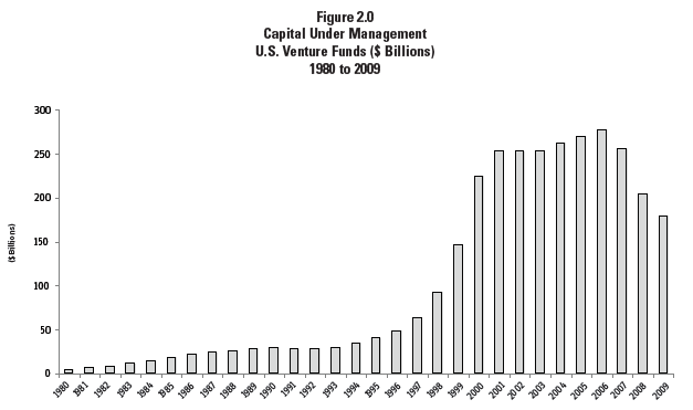
I first started writing and thinking about venture capital back in 1984, when I was working as an editorial writer for the San Jose Mercury News in the heart of Silicon Valley. For a sense of the shape of the industry, then and now, consider two figures. The first is from the 2010 “Yearbook” produced by the National Venture Capital Association, showing total assets under management for the venture capital industry.
If you look at the short little bars for the 1980s and squint a little bit, you can see that at the time, the rate of growth in the industry looked very large. The tiny little bar for 1986, for example, is a multiple of the even tinier little bar for 1982. But there used to be fairly restrictive rules about whether big pools of assets, like pension funds, were allowed to invest in venture capital. Those rules were relaxed, and the “dot-com” boom of the 1990s took off, bringing vastly more money into venture capital.
Here’s a graph from the most recent 2022 NVCA Yearbook, showing total assets under management by VC firms. From the general range of about $220 billion 15 years ago, the total has more than quintupled up to nearly $1 trillion in 2021. With the economic troubles unfolding in 2022, the VC assets under management (which is in part based on stock market values) will probably fall this year. But the overall trend from when I was writing about an industry with, say, $20 billion in assets back in the early 1980s is quite remarkable.
Another way to look at the VC industry is in terms of new investments made in a given year, rather than accumulated assets. The 2022 Yearbook reports: “Any concerns of US VC investment slowing down due to the pandemic were squashed in 2021. 14,411 venture-backed companies received $332 billion in funding, both metrics setting an annual record.” There probably some fluff in that statement “any concerns … were squashed,” but VC deal activity could take a step or two back in 2022 and still be far above the levels of just a few years ago.
I was a supporter of the VC industry and the role it plays in US innovation and start-up firms in 1984, and I’m still a supporter today. But it’s a really industry. You just don’t run a fast-growing $1 trillion industry the same way the $20 billion industry was run four years ago. Thus, it’s useful to have some real thought about what the VC industry does well and doesn’t really do at all. As a starting point, here’s a figure from the 2022 Yearbook:
Notice that from the perspective of the VC industry itself, the industry is not about very early-stage development of firms, or about early product development. Instead, the early stage VC investing happens when the cash-flow is no longer as negative as it had been, and it’s time to roll out the product itself. When the new firm has made the transition to growth and expansion, then it’s time for late-stage venture capital to think about an exit strategy of selling off the small firm to a larger firm, or going through an initial public stock offering.
Three issues are particularly concerning to us: 1) the very narrow band of technological innovations that fit the requirements of institutional venture capital investors; 2) the relatively small number of venture capital investors who hold and shape the direction of a substantial fraction of capital that is deployed into financing radical technological change; and 3) the relaxation in recent years of the intense emphasis on corporate governance by venture capital firms. We believe these phenomena, rather than being short-run anomalies associated with the ebullient equities market from the decade or so up through early 2020, may have ongoing and detrimental effects on the rate and direction of innovation in the broader economy.
In my own words, the VC industry has become enamored with web-based firms, especially those that might be able to make use of network effects to rule over their own little market sector. Such firms can often have relatively low start-up costs–no factories!–and can be evaluated in direct ways over a few years for whether they seem to be taking off. There is a substantial amount of “spray and pray” VC investing, where firms put money into a gaggle of these web-based companies, and then monitor the firms to see what takes off.
Again, you can’t run $1 trillion in assets the same way as you could run $20 billion in assets 40 years ago. It used to be that VC firms backed companies from a considerably wider array of industries, and played a more active role in offering guidance and business connections to the managers who were starting these firms. So while I do think the large and growing VC industry is, by and large, a force for good in the dynamism of the US economy, I also think the current version of the industry works best at a particular stage of the development of businesses in a fairly narrow industry range. From the big-picture perspective of US economic dynamism as a whole, the VC industry is a very particular slice of the pie.
The rate at which students completed college was rising from 1990 to 2010. There are several possible explanations why. Perhaps incoming students were better prepared than in the past. Perhaps colleges did a better of teaching, so that the average students learned more than in the past. Or perhaps the rising graduation rate mostly reflects grade inflation.
This figure shows the rise in college graduation rates (within six years of enrollment), with the black dashed line showing the overall average and the colored lines showing different groups of schools.
Can better-prepared incoming students explain this trend? Probably not. As the authors point out, the share of students attending college has been rising over time, which probably means that less-prepared students who would not have attended college in the past are now doing so. Good for them! But it means that a theory based on the idea that average income students are better-prepared isn’t likely. Average test scores in math and reading of 17 year-olds on the nationally representative National Assessment of Educational Progress (NAEP, sometimes called “the nation’s report card”) were not rising over this interval, either. There doesn’t seem to be a shift over time toward majors that have higher graduation rates. The partial evidence that exists suggests that college students spend fewer hours studying than in the past, but more hours in paid employment outside of class. As the authors write:
We discuss relevant trends that could affect college graduation, such as the college wage premium, enrollment, student preparation, study time, employment during college, price, state support for higher education, and initial college attended. The trends in these variables would predict declining college graduation rates almost uniformly. … [L]longitudinal, student-level datasets have information on high school student background, academic preparation, college enrollment, and graduation outcomes. We find that student characteristics, institutional resources, and institution attended explain little of the change in graduation rates. … Put another way, equally prepared students in later cohorts from the same zip code, of the same gender and race, with the same initial courses, the same major, and at the same institution have higher first- year GPAs than earlier cohorts.
But along with college graduation rates, college grades are also on the rise across the different kinds of colleges (except for the for-profit schools), which suggests the possibility of grade inflation.
Instructors, departments, and institutions may have incentives to inflate grades or increase GPAs [grade point averages] for reasons other than student performance. Instructors who give students higher grades receive better teaching evaluations (Krautmann and Sander 1999; Langbein 2008). Departments that increase grades see higher student enrollments (Butcher, McEwan, and Weerapana 2014). Additionally, colleges have strategic incentives to offer less informative grades (Boleslavsky and Cotton 2015) and institutional efforts to curb grade inflation can fail to make transcripts more informative and can instead reduce welfare (Bar, Kadiyali, and Zussman 2012). Increasing grades explain, in a statistical sense, a majority of the changes in graduation rates in our decomposition exercise.
How might one find evidence on the tricky topic of whether higher grade and graduation rates just reflect student learning more, or whether it is grade inflation? The authors have detailed student-level data from an unnamed “public liberal arts college,” which has trends in grades and graduation rates similar to the broader sample. At this school, they have access to scores on final exams and also to the grades given for classes. In some courses, the same (or very similar) final exams were given over time: as best the authors can tell, the final exams are not getting harder over time. They write: “Students with the exact same score on the exact same final exam earned better grades in later years. Our finding that grades are increasing over time, even when student characteristics and performance on identical comprehensive final exams are accounted for, suggests that standards for degree receipt are easing over time at the public liberal arts college.”
Why did grade point averages increase? The authors emphasize that there has been public and policy emphasis on higher graduation rates, and that “the increase in graduation rates is concentrated at public schools that have seen more of their funding tied to graduation. However, we find that grades have risen at all school types aside from for- profit colleges. Further, spending per student declined, suggesting that colleges did not increase spending to help students graduate.” That hypothesis is probably part of the truth. I also suspect that as costs of college have skyrocketed, there is more of a transactional sense to higher education: that is, you paid the bills and so you can expect to get the degree.
As the authors point out, a higher college graduation rate based on grade inflation isn’t necessarily a bad thing for society as a whole. After all, a given standard for graduating from college is not a fact of nature, like the boiling point of water, but rather a judgment call. Maybe it should be a little easier to graduate from college? But when the standard eases, it also has implications for how a college student with median or below-median grades will be viewed when trying to enter the labor market.
For some of my earlier posts on grade inflation at colleges and universities, see:
The pandemic recession from March to April 2020 and its aftermath–up to and including the current surge of inflation and the risk of another recession as the Fed raises interest rates to choke off inflation–seems to require a different set of lessons than basic textbook models. Th bottom line is to shift away from conventional thinking about aggregate demand and aggregate supply during recessions, and in particular to shift away from conventional thinking about fiscal and monetary stimulus, and instead to think more broadly about social insurance.
The standard stories about recessions start with aggregate demand or aggregate supply. Consider first if there is a drop in aggregate demand–an event often linked to a drop in investment, a drop in household purchases of durable goods, and to stress in the banking/financial system. However, the underlying capacity of the economy to supply goods as measured by workers, capital, and technology hasn’t changed. One option is this situation is to wait for all the effect of this drop in aggregate demand to filter through individual product and labor markets, where prices are likely to adjust slow and sticky ways, and hope the economy doesn’t get stuck on the way to a new equilibrium. The other option is to use fiscal or monetary policy to inject more demand into the economy. The standard belief, backed up by considerable evidence, is that a degree of activism will return the economy to good health faster than a wait-and-see approach.
But the pandemic wasn’t a demand-side shock, at least not when if first hit in spring 2020. Instead, it changed how work and industries functioned, and shut some industries down altogether. The productive capacity of the economy was disrupted, with some sectors suffering far more disruption than others. The banking/financial sector was largely OK; the public health center faced crisis-level challenges; and real-world supply chains were a mess. Employment first plummeted, but then has bounced back strongly. Instead of an unemployment job problem, an inflation problem has now emerged.
During a pandemic, workers in certain sectors face prolonged unemployment because their industries can’t operate safely, while workers in other sectors remain relatively unscathed. Had workers foreseen this possibility, they would have liked to purchase insurance against the risk that their sector would be closed. The social insurance framework can show which types of government fiscal actions best approximate what a well-functioning insurance market would provide.
A social insurance perspective is more appropriate for designing and evaluating pandemic fiscal policy than simple aggregate-demand-based models. Conventional Keynesian models of fiscal policy suggest that the way to deal with a recession is to increase aggregate demand quickly, and by enough to return output to its normal or potential level. And in this framework, it is not necessary for fiscal policy to closely target the workers or industries most affected by the recession. Raising aggregate demand anywhere will raise incomes and spending throughout the economy, and so help will eventually flow to those most affected. These models and policy prescriptions don’t hold in a pandemic recession. Because the virus thrives on human interaction (and hence on some types of economic activity), fiscal policy should not be aimed at quickly raising aggregate demand and attempting to return the economy to full employment. Doing so would make the pandemic worse and increase illness and deaths. Similarly, in a pandemic, some types of economic activity—such as in-restaurant dining and cruise travel—simply can’t take place safely. As a result, broad stimulus measures like one-time payments or tax cuts can do little to put workers in those industries back to work.
Their discussion focuses on two main aspects: What’s the useful way to think about social insurance for those made unemployed by a pandemic-style recession? What’s the useful way to think about supporting workers who become especially essential during a recession–and who society really wants to keep on the job?
For workers who become unemployed in a pandemic, the key incentive issue is that the government may not have much ability to determine, for the vast and diverse US economy, who cannot work because of the pandemic recession and who is choosing not to work. Thus, the appropriate policy design is to design the unemployment support so that those who continue working are better off than those who are not working–thus providing an incentive to work. Notice that the policy goal here is focused just on assisting a group of workers: it is not a broad-based fiscal or monetary stimulus for the economy as a whole.
They argue that the appropriate policy focus here is that lower-income unemployed workers should have a larger share of their income replaced in a pandemic than higher-income workers, because the higher-income workers are more likely to have other personal resources and wealth on which they can draw. However, the replacement rate of income needs to be less than 100%, so that there is an incentive to keep working. Based on a variety of evidence, they suggest that replacement of about 85% of previous income might make sense for lower-income workers; less for those with higher incomes. But the boost to unemployment insurance policies adopted in 2020 were so generous that they often replaced more than 100% of lost income. Romer and Romer write:
Taken together, these studies indicate that unemployed workers may have limited ability to self-insure, and that this ability may be substantially smaller among lower-income workers. This suggests that the replacement rate for unemployment benefits may need to be fairly substantial, though clearly less than 100 percent, to result in a loss of consumption in the 10 to 15 percent range. It also suggests that replacement rates should decline as prior income rises. However, the existing evidence is not enough to pin down optimal replacement rates precisely.
Even though we are unable to say what exactly replacement rates from unemployment insurance during a pandemic should be, it is clear that actual replacement rates have differed sharply from the prescriptions of a social insurance perspective. Ganong, Noel, and Vavra (2020) show that the flat $600 per week of additional [unemployment] benefits raised replacement rates to well over 100 percent for most workers. There appear to have been two forces behind the policies involving greater than 100 percent replacement. One is the pursuit of other objectives, especially redistribution toward lower-wage workers and aggregate demand stimulus. The other is idiosyncratic factors: Ganong, Noel, and Vavra (2020) report that an overestimate of the average wage of workers who would lose their jobs led policymakers to underestimate the impact of the $600 weekly adjustment on replacement rates, and that the very limited capacities of state unemployment insurance systems led policymakers to adopt the fixed supplement rather than more complicated additions to benefits.
Yes, these kinds of unemployment payments will raise aggregate demand in a recession, and that is a useful side-effect. But in a pandemic recession, it isn’t the main issue.
Another aspect of the Romer/Romer discussion is focused on essential workers. Some obvious examples during a pandemic might be those who work in health care and nursing homes. However, by late in 2020 there was some evidence that “healthcare workers no longer had significantly elevated COVID-19 risk. Instead, the occupations with the highest odds ratios of infection were food service workers (food counter attendants, bartenders, and waiters), transit workers, and cleaners …” Of course, it may also be that those in health care were more explicitly focused on holding down infection rates and might have been taking greater precautions.
Is it possible to design some form of “hazard pay” according to which occupations faced the greatest health risks from the pandemic? For example, the government could reach out to firms in certain industries and encourage them to apply, on behalf of their employees, for those frontline workers who might qualify for government-provided hazard pay. Romer and Romer discuss several different ways of estimating the number of workers who might qualify and the amount they might receive (based on risk of exposure). A broad-based program, for example, might have included about 10% of all workers. One could also imagine a system with perhaps two tiers: say, those who work directly with pandemic patients in the top tier betting perhaps an additional $4/hour, and those who are exposed because of broader public contact getting an additional $2/hour.
As it turned out, the state of Pennsylvania enacted a hazard pay premium of $3/hour. A federal hazard pay premium was proposed, but not enacted into law. It might be useful to design such a program now, specifying in broad terms how eligibility and hazard pay would be determined, so that it would be ready to go in a future pandemic.
Again, a hazard pay premium would raise aggregate demand in a recession, and that is a useful side-effect. But in a pandemic recession, it isn’t the main issue.
In the next day or two, I’ll return to this question of the appropriate response to a short, sharp, disruption like the spring 2020 COVID pandemic. This question of how to think about appropriate policy for a pandemic recession is generating its own wave of macroeconomic research. Again, some common themes of this literature are that thinking in conventional terms of fiscal and monetary stimulus, or aggregate demand and aggregate supply, may miss the point when when faced with a pandemic recession. For those interested in getting up to speed on the research literature, a starting point is the first three papers in the May 2022 issue of the American Economic Review (subscription required). These papers are also cited as background in the JEP Romer and Romer essay. To give a flavor of this research, I’ll just quote from the introduction by the editors:
“Supply and Demand in Disaggregated Keynesian Economies with an Application to the COVID-19 Crisis,” by David Baqaee and Emmanuel Farhi beautifully illustrates how a complex shock like COVID-19, combined with sectoral nominal rigidities, can lead simultaneously to the coexistence of tight and slack labor markets in different sectors. The paper highlights the importance of input-output networks and complementarities in production. …
“Macroeconomic Implications of COVID-19: Can Negative Supply Shocks Cause Demand Shortages?” by Veronica Guerrieri, Guido Lorenzoni, Ludwig Straub, and Ivan Werning explores similar territory. It shows how negative supply shocks can trigger even larger declines in aggregate demand. Both papers illustrate how traditional stimulus policies—such as monetary policy and standard fiscal stimulus—can have muted effects. Instead, transfer policies that offer insurance against sectoral shutdowns can deliver large gains.
“Effective Demand Failures and the Limits of Monetary Stabilization Policy,” by Michael Woodford, builds on the previous two papers by considering, formally, a model of the “circular flow of payments.” Disruptions in this circular flow can lead to a dramatic collapse of effective demand that cannot be remedied with conventional monetary policy, even away from the zero lower bound. As in the Guerrieri et al. paper, Woodford finds an important role for public transfers.
The UK referendum on Brexit passed back in 2016 (here were my reflections at the time). The British government vacillated for awhile on what the referendum meant, before eventually signing the EU–UK Trade and Cooperation Agreement (TCA) that went into effect starting January 1, 2021. Thus, the evidence on effects of Brexit is quite early, based on five years when nothing had been determined and a little more than a year with both a new treaty and a global pandemic. However, it’s not too soon to start collecting evidence and looking for patterns.
The Centre for Economic Research has produced one of its useful discussions of the evolving evidence in The Economics of Brexit: What Have We Learned?, with nine authors offering readable short overviews of their research, and a summary overview by volume editor Jonathan Portes. At this point, it’s obvious that the gloom-and-doom predictions of immediate disaster didn’t happen, but what did happen offers a number of political ironies. Here, I’ll lean on the overview of the chapters by Portes. He writes:
The TCA, while providing for zero tariffs and quotas on traded goods, contains very few provisions of any economic significance relating to the mutual recognition of regulatory standards, regulatory equivalence for services (including financial services), or labour mobility. Compared to membership of the EU (and of its Single Market and Customs Union), it therefore implies a major increase in trade barriers and trade costs in goods and services, as well as new restrictions on migration flows.
Concerning trade in goods, a pattern in the research seems to be that while large British firms had the international connections to largely continue their previous patterns of trade, many smaller firms have proved less able to do so.
[T]hey find no evidence of a statistically or economically significant decline in the UK’s trade with the EU relative to the rest of the world prior to the implementation of the TCA. By contrast, the actual introduction of the TCA caused a major shock to UK–EU trade, with a sudden and persistent 25% fall in UK imports from the EU, relative to the rest of the world. There is only a smaller and temporary decline in relative UK exports to the EU, but nevertheless a large and sustained drop in the number of trade relationships between UK exporters and EU importers. This suggests that the introduction of the TCA caused many small UK firms to stop exporting to the EU, but that larger firms were by and large able to absorb any extra costs.
There is some substantial irony here. One of the driving political forces behind Brexit was a sense in many parts of the UK that globalization and the EU were only benefitting London and big business. But as it turns out, London and big business have been able to deal with Brexit just fine.
However, as [Theimo] Fetzer points out, aggregate impacts are not the whole story by any means. His analysis suggests not only that the costs of Brexit are very unevenly distributed, but that, perhaps paradoxically, those areas that voted most heavily for Brexit are the worst affected, while London has escaped largely unscathed, at least so far.
One of the common promises of the pro-Brexit movement was that if the UK could escape Europe’s Common Agricultural Policy, food prices would decline. This prediction doesn’t seem to have come true, either.
Focusing on the food industry, Bakker et al. show that products more reliant on imports from the EU in 2015 saw larger increases in prices than those less reliant on the EU both immediately after the 2019 election – when it was confirmed that the UK would leave the Single Market and Customs Union – and the implementation of the TCA in January 2021. Using a differences-in-differences approach, they estimate a 6% increase in food prices due to Brexit over the two years to the end of 2021. … [T]he apparent upward pressure on food prices resulting from Brexit is certainly a far cry from the claims by some proponents of Brexit that leaving the EU’s Common Agricultural Policy would result in sharp falls in food prices … 2018).
Another main political driver of the pro-Brexit vote was concerns over within-EU immigration. In this case, British immigration policies seem to have pivoted so that while immigration from the EU has indeed become more difficult, immigration from non-EU source countries has become easier. Overall, Brexit has apparently led to more openness to immigration in Great Britain. Here, Portes describes his own research.
I describe the new system, which does indeed represent a very significant tightening of controls on EU migration compared to free movement. Migrants coming to work in lower-skilled and lower-paid occupations are, in principle, no longer able to gain entry. However, compared to the current system – and in contrast to earlier predictions – the new proposals represent a considerable liberalisation for non-EU migrants, with lower salary and skill thresholds and no overall cap on numbers. This implies that about half of all full-time jobs in the UK labour market could in principle qualify an applicant for a visa. This represents a very substantial increase – perhaps a doubling compared to the previous system – and also makes the new system considerably more liberal with respect to non-European migrants than that of most EU member states, which typically apply much more restrictive (de facto and/or de jure) skill or salary thresholds, and often enforce a resident labour market test. The provisions for international students after completing their studies are also relatively liberal.
So, the new system does not represent an unequivocal tightening of immigration controls; rather, it rebalances the system from one which was essentially laissez-faire for Europeans while quite restrictionist for non-Europeans, to a uniform system that, on paper at least, has relatively simple and transparent criteria. And this analysis appears to be born out in data on the operation of the system in its first year, where there has been a significant rise in work visas issues compared to pre-pandemic levels, particularly in the health sector, and an even larger rise in the number of international student visas. …
Ultimately, a key factor in the effects of Brexit will be in the major hole created by the TCA: countries in the EU have many of the same regulations, making trade much easier in service industries. Over time, British and EU regulations are likely to drift apart, and this barrier to trade is likely to rise over time. Portes writes:
Looking forward, the key issue is the extent to which the UK regulatory regime diverges from that in the EU, and the likely consequences. While some divergence is likely – for example, in insurance – there is little appetite in London for a ‘race to the bottom’; instead, gradual and piecemeal divergence is more likely. Over the medium term, the implication is that London will retain its prominence as Europe’s leading financial centre for the foreseeable future, but this dominance will be gradually eroded over time.
Here, I’ll try to summarize the BIS argument by breaking it into two chunks: the fundamental problem with crypto and the alternative vision for a future monetary system.
To describe the problem with cryptocurrencies, the BIS report offers what it calls a “scaleability trilemma,” but I just think of as the crypto trilemma. A “trilemma” is a situation where you can only get two out of three desirable outcomes. Here, the three potentially desirable outcomes are that a currency be secure, scaleable, and decentralized.
For example, conventional central bank money (the bottom line of the figure) is secure and scaleable. But it’s obviously not decentralized. Cryptocurrencies like Bitcoin and Ethereum are decentralized and secure. But there are about 2 billion digital payments made around the world every day. The process of updating the blockchains used to keep track of these kinds of cryptocurrency exchanges is notably costly in terms resources and is, by comparison with methods like modern credit card transactions, impossibly slow for addressing this volume of transactions. In other words, these secure and decentralized cryptocurrencies have not so far proven scaleable. Thus, the expansion of scale cryptocurrencies is in part driven by the arrival of new ones, which are decentralized but then often turn out to be less secure. A recent example is the collapse of the Terra “stablecoin,” a cryptocurrency that was supposed to have have fixed US dollar value, but ended up being worth nothing and wiping out about $60 billion in value. In April, the Wall Street Journal ran a story called “Crypto Thieves Get Bolder by the Heist, Stealing Record Amounts.” They point out that in the last 38 weeks, here have been 37 major hacks at cryptocurrency/blockchain organizations.
The BIS report puts it this way:
The limited scale of blockchains is a manifestation of the so-called scalability trilemma. By their nature, permissionless blockchains can achieve only two of three properties, namely scalability, security or decentralisation (Graph 3). Security is enhanced through incentives and decentralisation, but sustaining incentives via fees entails congestion, which limits scalability. Thus, there is a mutual incompatibility between these three key attributes, preventing blockchains from adequately serving the public interest.
Must this trilemma hold true? Or might it be possible, for example, to have a cryptocurrency that is both scaleable and secure? In the article that provides the “scaleability trilemma” above, Vitalik Buterin argues that a process called “sharding” can provide the answer. He writes “Sharding is the future of Ethereum scalability, and it will be key to helping the ecosystem support many thousands of transactions per second and allowing large portions of the world to regularly use the platform at an affordable cost.” The broad idea is that the process of verifying the blockchain would be randomly split up into many smaller pieces (“shards”), so that the transaction blockchain would in effect be verified by a “committee.”
The technical side of just how “sharding” would reduce the resource requirements of blockchain updating and verification in a way that is equally secure but much cheaper are a little beyond my grasp–at least without more effort than I’m willing to spend on the idea just now. I have heard other proposals for dramatically reducing the costs of updating the blockchain, as well. Of course, the real proof of the idea will be when or if it happens.
The BIS suggests the possibility that, rather than struggling with to resolve the trilemma, financial innovation might be better-served by building on central bank credibility. They suggest a metaphor which looks like this:
Central banks are the foundation. They continue to be hooked into the banking system and credit-card companies. The central bank might also provide a central bank digital currency (CBDC). But in this description, the central banks also become connected to “payment services providers,” who are non-bank firms that provide decentralized finance, tokenized assets and deposits, electronic money, self-executing smart contracts, autonomous wallets, and more.
The BIS goes into some detail about all this, digging down into issues of regulation, accountability, practicality, financial stability, consumer protection, and the like. As I see it, the basic idea is that it’s useful to think separately about cryptocurrencies and all the other financial innovations that are currently connected to crypto. Instead, it might be better for society if central banks made it possible to build the financial innovations of the future on the proven ability of central banks to provide currencies that are widely accepted and relatively in value.
Autor describes four (not necessarily exclusive) narratives that economists have used to discuss the question: “[W]hat is the role of technology–digital or otherwise–in determining wages and shaping wage inequality?” He discusses “four paradigms:” ” the education race, the task polarization model, the automation-reinstatement race, and the era of Artificial Intelligence uncertainty.” He starts with the narrative that was most common up into the 1990s, and continues to have many loyalists today. Autor writes:
Perhaps the most influential conceptual frame for understanding how technology shapes wage inequality originates with a short article published in 1974 by Dutch economist and Nobel Laureate, Jan Tinbergen. Tinbergen was intrigued by the observation that the wages of Dutch workers with post-high school education (which he called ‘third-level’ education) had been rising over the course of many decades despite vast increases in their supply. This pattern is hard to rationalize in a standard competitive setting since it seemingly implies that the demand curve for skilled labor is upward sloping. To interpret these facts, Tinbergen offered a simple but remarkably powerful analogy. Modern economies face an ongoing race between the demand for and supply of skill, with technological change propelling the demand curve outward and the educational system racing to push the supply curve outward to match it. In this telling, when the demand curve pulls ahead in the race, inequality between more and less-educated workers—college and non-college workers in the contemporary setting–rises, since more-educated workers are becoming relatively scarce. Conversely, when the supply of college-educated workers surges, as occurred during the 1970s, for example, when American men could defer the Vietnam draft by enrolling in college, earnings inequality between college and non-college workers falls. … [T]echnologically advancing countries must keep raising educational attainment cohort by cohort to keep pace with the moving target of rising skill demands. Or, quoting Lewis Carroll’s Red Queen, “it takes all the running you can do, to keep in the same place.”
As Autor points out, a relatively simple model capturing this race between a greater demand for skilled labor and supply not quite keeping up with that demand does a pretty good job of explaining the rise in the gap between wages of college graduates and those who have only a high school degree over the last five decades or so.
But as Autor notes, the “education race” narrative has some unanswered question. Must it be true that any advances in technology will always have this effect of requiring more high-skilled labor? Is it possible that some technology might instead have a a greater benefit for low-skilled labor? In addition, does new technology benefit all broad groups of workers, while benefitting some more than others, or might new technology make some broad categories of workers worse off?
The “task polarization” model seeks to address these questions. The idea is to categorize jobs in an economy according to the skills they need. In particular, this narrative emphasizes that “computers accomplish a distinctive subset of tasks, those involving routine codifiable activities that can be fully described by a set of rules and procedures, encoded in software, and carried out by non-sentient machines.” Notice that we are no longer talking about technology in general–say, past technological advances from transportation to electricitity to chemicals or factories–but are now focused on the specific technological change that seems of greatest immediate relevance in recent decades.
The task polarization framework suggests that computerization will have different effects according to the tasks of workers. Technologies based on computerization will have the effect of “displacing the tasks of the middle-skill workers who in many cases previously provided these information-gathering, organizational, and calculation tasks (e.g., sales workers, office workers, administrative support workers, and assembly line production workers).” However, ‘[t]he productivity and earnings power of workers who specialize in abstract reasoning, expert judgment, and interpersonal interactions and leadership rises as the inputs into their work—information access, analysis, and communication—becomes less expensive and more productive. Thus, computerization increases the productivity of better-educated workers whose jobs rely on information, calculation, problem-solving, and communication, e.g., doctors, architects, researchers, and stock analysts.”
For a third group of workers, computerization has little effect:
However, not all tasks that are hard to automate would be classified as high-skill tasks. Tasks such as waiting tables, cleaning rooms, picking and boxing items, or assisting elderly people to perform acts of daily living, require dexterity, sightedness, simple communications, and common sense, all of which draw on substantial reservoirs of tacit knowledge. Such tasks are commonly found in personal services jobs, e.g., food service, cleaning, security, entertainment, recreation, and personal care. Computerization has generally not substituted for workers in performing such jobs. But neither has it strongly complemented them. Rather, it leaves this work largely untouched, neither automating the central tasks of this job nor augmenting the workers doing it. Moreover, because a large fraction of adults can, with modest training, perform the core tasks of many non-routine manual jobs, such jobs will generally not pay high wages even when demand is rising, except when the labor market is very tight (as is currently the case).
As Autor points out, an array of empirical research in labor markets of high income countries support the overall prediction of the task-based model that computerization technologies will tend to have a polarizing effect on the income distribution: benefit those with high school levels, injure the job and wage propects of those with intermediate skill levels, and have little effect on lower-paid workers. As one example from the US labor market, Autor notes: “Acemoglu and Restrepo (2021) estimate that 50 to 70 percent of the increase in earnings inequality between education, sex, race, and age groups during 1980 through 2016—and the entirety of the fall in real wages of men without high school—are due to the adverse effects of automation on worker groups that were initially more specialized in routine task-intensive work.”
Notice that the task-based approach does not contradict the education race approach, but instead digs down into the particular effects of computerization. But the task-based approach continues to leave some questions unanswered. Must technology have this kind of effect on wage inequality, or is this a peculiarity of computerization technology in particular. Also, the task-based approach in its simplest form seems to argue that the tasks of a given job or worker are fixed and unchanging, when we all know that tasks in a given job and indeed the jobs themselves can evolve over time. One cannot answer the question of technology affects wages without some insight into these new jobs.
Autor offers a vivid illustration of how jobs evolve over time. The blue bars show how the US workforce was divided up by sector in 1940. The neighboring green/pink bars show how the US workforce was divided by sector in 2018, with the green bar showing how many people were doing the same job categories as in 1940, and the pink bar showing how many people were doing jobs in categories that did not even exist in 1940. Thus, you can see that the share of US workers in farming/mining falls from about 18% to less than 2% during this time period–and half of the workers in farming/mining jobs in 2018 didn’t had jobs that didn’t exist in 1940.
As Autor is quick to acknowledge, economists don’t have great theories of how certain new job categories are created rather than others. But we can say something about past patterns:
Autor et al. (2021b) estimate that more than 60 percent of employment in 2018 was found in job titles that did not exist in 1940 … The introduction of new work, however, is not uniform across skill groups. Between 1940 and 1980, most new work that employed non-college workers was found in construction, transportation, production, clerical, and sales jobs–which are squarely middle-skill occupations. In the subsequent four decades (1980–2018), however, the locus of new work creation for non-college workers shifted away from these middle-tier occupations and towards traditionally lower-paid personal services. Conversely, new work creation employing college-educated workers became increasingly concentrated in professional, technical, and managerial occupations. In combination, these patterns indicate that new work creation has polarized, mirroring (and in part driving) the aggregate polarization of employment …
Again, it is an open question whether these patterns of new work and tasks must follow this pattern moving forward, or whether it might be possible for new work and tasks to focus more on middle-skill occupations.
The last of Autor’s four paradigms is “the present era of artificial Intelligence uncertainty,” and at this stage, it’s more about questions than answers. Instead of substituting for routine tasks, like computerization, the emerging artificial intelligence technologies may be able to replace certain kinds of expert judgement. Remember, artificial intelligence doesn’t need to be perfect at these tasks to be useful: it just needs to be more consistent or accurate than at6 least some of the humans currently doing these tasks.
At present, discussions of artificial intelligence tend to rely on “perhaps” and “possibly.” For example, one possibility is that middle-skill workers, equipped with artificial intelligence can be empowered to become more productive, while some some high-skill workers will find the value of their knowledge and expertise will be eroded. Perhaps artificial intelligence will substitute for many workers and the middle- and high-skill level, but will have a hard time substituting for low-skill personal service jobs, and thus will make those workers relatively better off. It is quite unclear what kinds of new jobs and tasks might be facilitated and encouraged in an economy with greatly improved artificial intelligence capabilities.
Autor summarizes his thinking in this way:
What these observations imply is that the work of the future is not an empty set—not even remotely. In Autor et al. (2022), we write that “No compelling historical or contemporary evidence suggests that technological advances are driving us toward a jobless future. On the contrary, we anticipate that in the next two decades, industrialized countries will have more job openings than workers to fill them, and that robotics and automation will play an increasingly crucial role in closing these gaps. Nevertheless, the impact of robotics and automation on workers will not be benign. These technologies, in concert with economic incentives, policy choices, and institutional forces, will alter the set of jobs available and the skills they demand.” It is that adaption that creates both challenge and opportunity. The problem that industrialized countries face in the immediate decades ahead is not a shortfall in the quantity of jobs. It is rather that many of the jobs may be of low quality, use only generic human capacities, and provide little opportunity for skills acquisition, specialization, and rising lifecycle productivity. This is not a new problem, however. It has been unfolding over four decades. And in general, the U.S. has adapted to it poorly.
The Behavioral Economics Guide 2022, edited by Alain Samson, begins with an essay by Dan Goldstein that offers an unnerving reminder for studies that compare only a few potential outcomes, rather than the full range (“Leveling up Applied Behavioral Economics”). He sets the stage:
You’re sitting in a workshop in a hotel somewhere in the world. You know the kind, with the U-shaped table and the dozen people and the bottle of sparkling water for every person. It’s 10 in the morning, someone’s presenting, and you’re having productive daydreams. You’re inspired, and you know because it’s 10 AM you’re about to have the best idea you’ll have all day. You hear something about probability weighting, that is, how people overweight small probabilities when they read them (as in the gamble studies on which prospect theory was built) but underweight small probabilities when they experience them (Hertwig et al., 2004). You start thinking about communicating probabilities with visual stimuli. You think that if people see visualizations of probabilities, it would be different than reading about them and different than experiencing them. Because frequency representations help people in other tasks (e.g., Walker et al., 2022), perhaps people seeing visualizations of probabilities as frequencies would cause them to neither overestimate nor underestimate the probabilities they represent. You think that if you can find a way to visually display probabilities as frequency-based icon arrays, without language or simulated experience, it might have a lot of applied uses and improve decision-making in other tasks such as mortgage borrowing, gambling, or investment.
So the idea goes something like this. Show people a grid like this one. Ask them to estimate the number of black squares, which can be viewed as a way of presenting a probability (in this case, 24 out of 100 or 24%). It’s not clear what will happen. Will people follow the common pattern of underweighting smaller probabilities and overweighting larger ones? Or will they on average accurate in their predictions?
As Goldstein tells the story, you pick some values to test this theory, and you have a friend pick some values to test the theory. But when you get together to talk it over, you find that you have opposite results! How can this happen? The problem arises because you and your friend each looked a just a few results, not at the full range of possibilities from 0 to 100. When Goldstein and co-authors did a study with a full range of values, here’s what they found. Estimates of the number of boxes were pretty good at low levels under about 10; slightly overestimated at levels around 20; substantially underestimated from about 35 to 55; substantially overestimated from about 65 to 80; slightly underestimated at about 90; and then pretty accurate for high levels above 95.
In Goldstein’s hypothetical story, imagine that you tried out just a few values shown by the black boxes, while your friend tried out just a few values in the orange boxes. Each of you would be missing a big part of the puzzle. Clearly, looking at only a few values can be deeply misleading; It’s only by looking at all the potential outcomes that one can draw a conclusion here. Goldstein writes:
When you test all the values from 0 to 100, you get this very weird—but very reliable—up, down, up, down, up pattern. I believe it was first discovered by Shuford in 1961 (see also Hollands & Dyre, 2000). Since you tested low values under 20 and high values around 50 and 90, you saw overestimation at low values and underestimation at high values. However, because your friend tested low values around 30 and high values around 70, they saw the opposite, namely, underestimation at low values and overestimation at high values. The moral of the story is that looking at the world through the keyholes of a two-level design can give you a very misleading picture.
Any study that offers on a few selected options out of a broader range will face this potential problem. As a real-world example, consider the problem of a program that seeks to encourage people to save for retirement. You want to describe to people the benefits of saving. Is it better to emphasize to people the total value of their savings or how much they could receive per month in retirement benefits? The following pattern emerges:
If you ask people about which they find more satisfactory for retirement, a lump sum of money or an equivalent annuity, they often say the lump sum sounds more satisfactory. For example, people tend to say that a $100,000 lump sum seems more satisfactory than $500 / month for life … Upon hearing this, people might say, “What’s new there? Everybody knows that chopping up large amounts into monthly amounts makes them seem smaller. That’s why companies advertise their monthly instead of their annual prices! That’s why charities ask you to donate pennies per day!”
However, … when you ask about larger amounts of money, people find the lump sum less, not more, adequate. For example, $8,000 / month for life sounds more adequate than a $1.6 million lump sum. What happened to the conventional wisdom that monthly amounts seem like less? Where’s the pennies per day effect everyone knows about?
Again, a study that offers only a few options may give a misleading result.
The volume includes descriptions of a number areas of recent research in behavioral economics, a 42-page glossary of behavioral economics terms from to “Action bias: to “Zero-price effect (with references!), nd pages of advertising for graduate programs in behavioral economics. As a sample, I’ll just mention one of the other research discussions, this one about the “FRESH framework” that applies to whether people show the self-control to meet long-run goals, Kathleen D. Vohs and Avni M. Shah: From the abstract:
[W]e distilled the latest findings and advanced a set of guiding principles termed the FRESH framework: Fatigue, Reminders, Ease, Social influence, and Habits. Example findings reviewed include physicians giving out more prescriptions for opioids later in the workday compared to earlier (fatigue); the use of digital reminders to prompt people to re-engage with goals, such as for personal savings, from which they may have turned away (reminders); visual displays that give people data on their behavioral patterns so as to enable feedback and active monitoring (ease); the importance of geographically-local peers in changing behaviors such as residential water use (social influence); and digital and other tools that help people break the link between aspects of the environment and problematic behaviors (habits).
My standard riff on whether the US dollar will remain the world’s dominant currency going forward (for example, here, here, and here) hits some of these themes: It’s useful for world commerce for many transactions to be done in a single currency. The dominant currency at any given time has a lot of momentum, and shifts in the dominant currency don’t happen easily. At least so far, the leading candidates to displace the US dollar as the world’s dominant currency, like the euro or the Chinese renminbi yuan, don’t seem to be doing so.
The authors focus in particular on the mixture of currencies that central banks around the world are holding in their foreign exchange reserves. The blue line shows the decline in holdings of the US dollar by central banks from 71% in 1999 to 59% in 2021.
However, the figure also shows that this decline of the US dollar in the foreign exchange holdings of central banks has not been accompanied by a substantial shift to any single alternative currency. The euro, shown by the red dashed line, rose when it was introduced in the early 2000s, but has since fallen back to pretty much the same level. Neither the Japanese yen (black line) nor the British pound (yellow line) has shown much of a rise. Instead, the fall of the US dollar has been accompanied by a rise on the “other” category from 1999. About one-quarter of this increase is the Chinese renminbi. Other currencies playing a notable role here are the Australian dollar, the Canadian dollar, and the Swiss franc.
What is driving central banks to shift their foreign exchange reserves from US dollars to these “other” currencies? The authors suggest several reasons.
First, global financial markets have become much more developed and interconnected in the web-enabled age, making it easier to hold small amounts of “other” currencies. They write: “But as transactions costs have fallen with the advent of electronic trading platforms and now automated market-making (AMM) and automated liquidity management (ALM) technologies for foreign exchange transactions, the savings associated with transacting in U.S. dollars are less. … In addition, the expanding global network of central bank currency swap lines (Aizenman, Ito, and Pasricha, 2021) has enhanced the ability of central banks to access currencies other than the ones they hold as reserves, weakening these links across markets and functions.”
Second, many central banks are holding larger quantities of foreign exchange reserves, which in turn makes it more worthwhile for the central banks to look around at what currencies are paying a higher return. In particular, lower returns on government bonds denominated in the standard reserve currencies (US dollar, euro, Japanese yen, British pound) have made it attractive to seek out and to diversify across other currencies.
These reasons apply more broadly than central banks, of course. It may be that the US dollar is not exactly replaced as the dominant global currency in an abrupt way, but instead is just nibbled away around the edges as it becomes simpler and cheaper to transact in a wide array of currencies.
Here’s one other issue worth considering: Every time the United States uses the dominant role of the US dollar in international markets as a policy tool, via economic or financial sanctions, it gives other nations a reason to shift at least somewhat away from reliance on the US dollar as a mechanism for transactions.
The issue of migrating across international borders is to find better economic opportunities is entangled with the notion of becoming a permanent resident and then a citizen of the host country. Is it possible to separate these elements? The idea of rotational migration is that people would migrate for a time, and perhaps just to specific place, and then go back to their original starting point. Lant Pritchett offers some thoughts on this idea in an interview with Shruti Rajagopalan (Discourse, “Ideas of India: Reforming Development Economics, June 9, 2022).
I’ll add that this is actually part 2 of the interview, with part 1 appearing as “Ideas of India: Where Did Development Economics Go Wrong?“( March 17, 2022). Pritchett has strong opinions on many topics, including his dislike of using a poverty line of $1.90 in consumption per day in developing countries to his opposition to randomized control trials. Agree or disagree, it’s worth hearing him out.
Pritchett is discussing the situation in India where it appears that there are large potential gains from moving away from certain poor rural areas and toward more densely populated areas. Some people do this. But many others migrate only for short periods, or during certain seasons, in part because they are concerned about losing what they perceive as the basic security of their rural property ownership. He says:
I think a lot of people in India in the rural areas have something to lose. Hence it freezes them in place because they can’t get a good return out of it and take the lump sum and move to the city. They can’t, as a family unit, as a census-counted unit, move to the city without just the risk of losing their property. Somebody has to stay at home.
I think you get a lot of fractional migration, meaning parts of the household move. My conjecture is the census radically undercounts that. I had heard when I was living in India in 2005 or so, there was a prominent Indian sociologist who was basically saying, “Look, if you go into villages in India, there’s nobody there.” The census might be undercounting migration by a factor of two.
If you had 200 million people in India that had moved, out of a population of 1.3 billion, that seems consistent with the true gains to mobility. They would be moving on a rotational basis because they wouldn’t give up in some sense their claim to the family household, the family plot.
It does mean then this leads to a whole different set of conjectures about India’s response to the changes since, say, the liberalization in 1991. I think the people who bet on staying in the rural areas made a big mistake. A lot of the divergence in inequality within India is the result of people just above, who owned a little bit of land and thought, “Well, I can’t give that up to move to the city.” Then just owning a little bit of land in rural India did not turn out to be a great long-term bet.
From the context of the US economy, this idea of rotational mobility raises two interesting issues: one about mobility within the US, one about immigration to the US.
For mobility within the United States, it used to be a common historical pattern that a number of people from lower-income areas would migrate to higher-income areas. However, as housing prices have skyrocketed in a number of urban areas, the economic incentives for this kind of migration have diminished. Indeed, there’s evidence that if a low-skilled person moves to an expensive area in the US, the higher cost-of-living in the new area can easily more than offset any higher wages the person earns, so the move provides no economic benefit. What if it was there were labor market institutions for people to migrate from low-wage to high-wage areas within the United States for limited periods of time, so they could take advantage of the higher wages without having to face the worst of the high cost of living?
For immigration into the United States, what if there was a practical way to have workers come for a limited time or only to a particular region? Pritchett says:
I never talk about open borders; I talk about greater labor mobility. And the reason I talk about greater labor mobility is I think there’s a big tension facing the world. The rich societies are just aging in really extraordinary terms. So people talk about low population growth, but low population growth isn’t the issue. The issue is the inversion of the demographic pyramid. And the inversion of the demographic pyramid is creating societies that just have way too few workers relative to the number of retirement-aged. And it gets worse and worse inevitably over the next 30 years. Now, the difficulty is that most of the way the regime for mobility of persons around the world has worked since the 1920s is that people who are allowed to work in a country are either citizens or on a path of citizenship in the country.
I’m actually a big advocate of separating those two things and saying the needs of U.S. or Germany or France for labor are not being met. Because if the only way in which a person can come and work in France—to take care of the elderly or perform relatively low-skilled services—is by allowing that person to become a French citizen, the political consensus is no. We’ll prefer not having the service.
I don’t know if you remember that scene from “The Matrix” where Neo encounters the architect, and he says, “Look, we’ll wipe humans out.” And Neo says, “Well, if you wipe humans out, then you won’t have all the service you get from these humans.” And the architect says, “There’s levels that we’re willing to go.” And I feel like increasingly, the rich world is saying, “There are sacrifices we’re willing to make if our only choice for having people work in our country is putting them on a path to citizenship,” which, given the magnitudes of the flows, is inevitably going to change everything about the society and the politics and everything else.
People like Paul Collier write saying, “Look, people just want this sense of national identity. And hence if you force them to choose between preserving national identity and meeting the labor needs that exist, they’ll make hard choices in favor of national identity,” which I think is where we are. My big thing is if we actually had rotational mobility, in which people could come and perform the labor services but not necessarily instantaneously be on the path to citizenship, this could be a big thing that would be a win-win-win. It would be a win for the countries that need the labor. It would be a win for the workers that move. It would be a win for the sending countries.
Open borders implies that these concerns of national identity are going to go away or be weak. I don’t look at any rich country and see those concerns getting weaker. … Doesn’t sound like the world’s getting friendlier to open borders. That said, the needs for this labor are going to get so huge, in my view, that there needs to be some intermediate solution. I think a well-regulated industry that does rotational mobility is a massive, massive opportunity. …
There has been massive out-migration from rural areas of large swaths of America for a very long time. I don’t see Cleveland or Toledo or Mississippi or a lot of these places having super strong NIMBY-ism pressures. If you could reassure people [current US residents] that these people [immigrants] are going to come and work, they’re going to be part of the local economy, but we’re not pre-committing from the minute they arrive that they’re on the path to citizenship. Again, I’m not saying every rotational mobility doesn’t have some path to citizenship, but it’s not immediate and automatic. …
Particularly, by the way, if you could make rotational migration be region-specific, I think that would change the political dynamics a ton. If you could give a person a visa to come work in the United States, but they could only work in designated YIMBY areas, then, of course, the whole national dynamic that everybody worries, that all the migrants want to go to Silicon Valley or all the migrants want to go to New York, could be addressed.
The difficulty is these discussions aren’t even on the table. Nobody’s even talking about all of the various ways in which very clever rotational labor mobility could be designed and used, and the win-win-win that could be produced if we had this legally enforced, industry-engaged mobility. I think if we started to think hard about it, we could develop and design things that would slice through some of these political considerations. We have to be open to the—not all labor mobility is citizenship.
The classic argument against rotational migration is that, whatever its theoretical merits, in practice it becomes a backdoor mechanism for more immigration. One classic example is Germany’s experience several decades back with admitting guest-workers with the explicit understanding that they could be sent home. However, Germany then found that that in practical terms, when people have arrived, become neighbors, fallen in love, had children, and entered the community, sending them home becomes something close to a practical impossibility. As the Swiss novelist Max Frisch reportedly once said: ”We imported workers and got men instead.”
But the pressures of low birthrates and aging populations in the US and other high-income countries are going to exert pressures of their own. Perhaps rotational migration needs to be revisited.
When I get the quarterly announcements for what my retirement account is now worth, and a drop in the stock market has caused the total in the account to decline, I find myself looking at some of the long-run patterns in stock market prices.
To set the stage, here’s the historical pattern of the S&P stock index since back in the 19th century. In interpreting the figure, notice that the vertical axis is a logarithmic axis showing proportional changes; for example, the tripling from 10 to 30 is the same size as the tripling from 100 to 300 and the same as the tripling from 1000 to 3000. (Without using a log scale, all the smaller values–like the stock market crash of 1929, would just be a little squiggle what would look like a nearly flat line on the far left of the figure.) You can see some of the well-known changes in the stock market over time: the run-up of the 1920s, the crash of 1929, the run-up of the 1960s, the comparatively flat market of the 1970s, a big jump in the dot-com market of the 1990s, the run-up since 2009, and the recent decline. Of course, whenever you consider the possibility that the
For a slightly different view, here is the same set of data, this time adjusted for inflation. Again, the vertical axis shows proportional change. Again, the main well-known changes are pretty visible, but they don’t all look the same. For example, after adjusting for inflation, the Black Tuesday stock market decline in the 1920s looks even more striking, and during the high-inflation 1970s, the real value of the S&P 500 index is falling.
Of course, stock market values should be affected by expectations of corporate earnings. Thus, the standard price-earnings measure of the stock market looks at stock prices divided by corporate earnings over the previous 12 months. Notice that the logarithmic scales have now gone away. Corporate earnings will rise over the long run both because of inflation and along with overall growth in the economy. Thus, one might expect to see the P/E ratio be roughly the same over time, of course with some fluctuations as economic events and market trends interact. Indeed, when you try to find the 1929 stock market crash in this data, it’s barely apparent: after all, if both stock prices and corporate earnings collapse at about the same time, then the ratio of the two may not move in an especially dramatic way.
You can also see that from the late 19th century up to about 1990, the P/E ratio didn’t seem to have a long-run trend. It moved up and down, but was typically in the range of about 15-20. Starting in the 1990s, however, the P/E ratio moved way out of its historical range, first during the dot-com boom of he 1990s, then in the run-up to the 2008-9 Great Recession. After its recent decline, the P/E ratio is now actually back in its historical range.
Notice that with this longer-term adjustment, Black Tuesday in 1929 becomes apparent again: essentially, the rise in stock prices in the 1920s and the fall in 1929 is now being compared not just to contemporary earnings, but to earnings over the previous 10 years. Something similar happens in the Great Recession of 2008-9: that is, the sharp decline in earnings drove the unadjusted P/E ratio in the previous figure sky-high, but when earnings are averaged over the previous decade, the CAPE ratio doesn’t show a similar peak. Again, there doesn’t seem to be much long-run trend in stock market prices up to about 1990, but then stock prices break out to historically high levels.
Recent movements in stock market prices look a little different in the context of CAPE ratio. The jump in 2021 looks smaller than with the regular P/E ratio, and the recent decline also looks smaller. The difference arises because corporate earnings have grown rapidly in the last five years or so. This growth in earning tended to hold down the plain vanilla P/E ratio up to 2021–because the S&P 500 was rising with these earnings–but with longer-term average earnings taken into account the rise in stock market prices pre-2021 becomes more apparent. By the CAPE metric, stock prices after their recent decline are still at high although not historically unprecedented levels,
There are reasons that a higher-than-normal CAPE might be appropriate in 2022. First, interest rates are lower than inflation, so the real interest rate (the nominal rate minus the inflation rate) is negative. This should increase the amount an investor should be willing to pay for $1 of current earnings since earnings (and the dividends they fund) should grow with inflation while the alternative of holding a bond rather than a stock is less attractive because of still low nominal interest rates. Second, high price-earnings ratios in the United States partly reflect a sectoral sorting between the United States and Europe in which the United States has more high-growth technology companies and Europe more slower-growing consumer goods corporations. Third, CAPE, by design, underreacts to recent earnings growth. Earnings have grown very rapidly in the last decade: After not growing at all per unit of the S&P 500 between 2006 and 2016, earnings have almost doubled in 5 years, adjusted for inflation. When attempting to predict future performance using past performance, it is sensible to put more weight on more recent performance. CAPE does not do this; in benchmarking value against equal-weighted average prior earnings, it implicitly takes the 10-year average as its prediction of future earnings. Valuations in 2021 look less like an outlier if we benchmark them with prior-year earnings, as in the simple P/E ratio.
From 1970 to the present, the average value of the Buffett ratio is a little under 90%: that is, the ratio of the value of all publicly traded stocks to GDP was a little under 90%. When Buffett made his comment in 2001, you could have made money expecting the ratio to decline: indeed, you could have also made money on this advice up to the period before the Great Recession. But the run-up in stock prices since 2009 took stock prices to about 200% of GDP before the recent decline–and the value still sits at about 170% of GDP. As Zitzewitz notes, your confidence in this stock market value will depend on the extent to which you think recent increases in corporate earnings are likely to be lasting, as well as on how you evaluate the “sectoral sorting” of high growth companies into the US economy.
Of course, whenever you are contemplating that perhaps the stock market is behaving irrationally and that perhaps you can make money betting that it will return to its “true” value, it is worth remembering the uncertainties involved in such judgements, and in particular, to remember the old investment aphorism that “the market can remain irrational longer than you can remain solvent.”